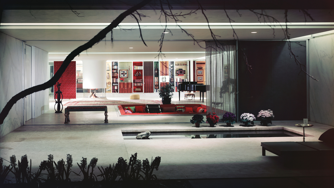

In The Principle of Cladding, one of many polemics by Adolf Loos, the Austrian architect defined the profession’s task as “providing a warm and liveable space”. One evolving from the tradition of the coverings of early built structures — made from animal skins or textiles. “Carpets are warm and liveable,” Loos wrote. “He [the architect] decides for this reason to spread out one carpet on the floor and to hang up four to form the four walls.”
In 1903, five years after publishing the essay, Loos designed a bedroom for his wife, Lina. Within the white walls was a layer of ‘cladding’: white linen curtains strung on a rail that circled the room, a white Angora sheepskin rug that stretched over the bed frame like moss, with linen curtains and ‘skirts’ masking wardrobes, and draping bedside tables. The interior looks warm, soft, and contained — enveloping the body in a “bag of fur and cloth” — while the semi-sheer curtains also present the bedroom as a sort-of stage, or frame for observation.
Loos saw architecture and interiors as theatrical, and the inhabitants of his buildings both the observer and observed. While seeking comfort and warmth through architecture, Loos’s environments maintained a degree of detachment that meant any softness was balanced with a sense of control. The house was to be designed in harmony with the character of its inhabitants, that character split between the public and private spaces, the social and intimate being.
While his public statements were clear to the point of dogmatic, in reality Loos was a mess of contradictions. He argued for the task of the architect being to not “imitate” or dress up materials as something else, and was defensive of the idea that a living space constructed from rugs would be classed an imitation: “The walls are not really built out of carpets! Certainly not. But these carpets are meant only to be carpets and not building stones.” Loos was tyrannical in his disdain for “imitation and surrogate art”, artificial stone tiles, or painted inlays, and would often hurl his critiques as sexist slurs. He warned against ornament and decor as women’s work, women being “primitive, ignoble savages” in comparison to the “cool and detached” modern man. But the soft, fluffy, bedroom of Lina Loos, with its curved edges, sheer fabric and shining silver metal, is neither cool or detached. It embraces ornament, high camp and decor, and as is often true, Lina likely had more to do with it than the record shows.
But this split between the public and private self, of the self in principle and in practice, was a constant in Loos’s life. In public his judgements and moralism led to a rift with the Secession movement, long diatribes, and many drawn-out, public arguments; while in private he had three short marriages to women at least half his age, and was found guilty of child sexual abuse. In ‘Sex, Lies and Decoration: Adolf Loos and Gustav Klimt’, architectural theorist Beatriz Colomina wrote: “Loos’ public moralism denouncing ornament as a savage perversion is perhaps a pathological symptom of what it attacks, a disguise, a displacement.”
Loos sought the control of the senses within his architecture, and the formal order of the theatre box became the frame within which he worked. A space that is both private and a setting understood for performance or at least a position from which you will be viewed and projected onto. In the house Loos designed for Josephine Baker, she became the ‘primary object’, with reflective surfaces and openings between rooms shifting attention consistently back on her. But the primacy of the visual is denied through his writing, where he focuses on the “mind’s eye” of the architect, and his sense of what “he [the architect] wishes to exert upon the spectator”. The principle that the person inhabiting the house is the spectator, and not he — the architect — the external voice, shows how Loos thought about the people he designed for. Loos saw his role as providing a “warm and liveable space”, but the way that he detached life from work, theory from practice, interior from exterior, dislocated the potential for his work to contain a sense of ease, as the home becomes a stage.