World of Interiors

PARAVENTI — FONDAZIONE PRADA

‘Paraventi’, plural for ‘paravento’, describes an object that protects, and provides shelter from the wind. A folding screen that acts as a barrier, a room divider, a facade that invites intimacy while performing to those outside of its embrace…

‘Paraventi’, plural for ‘paravento’, describes an object that protects, and provides shelter from the wind. A folding screen that acts as a barrier, a room divider, a facade that invites intimacy while performing to those outside of its embrace; through the suggestion of what it conceals and reveals, and the compositions stitched, drawn, painted and printed onto its surface.

‘Paraventi: Folding Screens from the 17th to 21st Centuries’, curated by Nicholas Cullinan at the Fondazione Prada, Milan, examines the object, and the questions that surround it: “Painting or sculpture? Art or furniture? Utilitarian or ornamental?” The exhibition presents the history of the folding screen, from its origins in China — where they were designed as objects of spiritual contemplation — their migration to Japan, through India, and into Europe. Folding screens have been understood variously as objects that can ward off malign influences, pieces of furniture that both serve a function and communicate status, props in theatre and opera, and structures upon which artists and designers can literally and figuratively project onto, enlivening the object with artistic expression.

On the ground floor of the Fondazione’s Podium building, curves of transparent plexiglass and winding curtains designed by architectural firm SANAA create fluid partitions between thematic groups of folding screens, enclosing and opening up spaces, and inviting both an intimacy and expansiveness to the exhibition, where the ‘paraventi’ become the protagonists who are concealed and revealed. Defining themes are grounded in geography, the physical qualities of screens, and their position in space; organised more by mood, the conceptual possibilities of a screen, and their potential for subversion.

Each area is implied by the scenography, rather than being signposted in the space, and the exhibition flows with ease across time and space, with a balance of context and order, offering up multiple views and interpretations. A pair of screens from 17th century Japan recount the final battle of the Genpei civil war in the 12th century, the ancient battle reaffirming the martial credentials of samurai families; Wu Tsang’s Rebellious Bird (2023) is projected onto a curtain, the video “unfixed” by the movement of fabric, the performative boundary, as Tosh Basco performs gestures inspired by 1875 opera Carmen; Carrie Mae Weems’s The Apple of Adam’s Eye (1993) makes use of the biblical story as a a study of desire, power, and gender — an embroidered text on the back of the screen reading: “Temptation my ass, desire has its place, and besides, they were both doomed from the start.”

The Arts and Crafts Movement is represented in a screen by William Morris, Jane Morris, and manufacturer Elizabeth Burden — Screen with Embroidered Panels Depicting Lucretia, Hippolyte, and Helen (1860-1889) — which stands between definitions, of art and furniture, utility and ornament; Goshka Macuga presents in time or space or state (2023), a folding screen as three sections of bookshelves; Mona Hatoum’s Grater Divide (2002), an oversize cheese grater, functions as both a parody and surreal, almost menacing presence. Elmgreen & Dragset’s Paravent (2008) makes use of the artists’ characteristic humour and understanding of the potential of every element of a work to perform — the screen cut out with two glory holes, a roll of toilet paper hanging on the back, and two pairs of Levi’s 501 jeans discarded among it. Marc-Camille Chaimowicz’s Folding Screen (Five-Part) (1979) continues the principle of performative objects, with a folding screen drawn from his flat which he designed as a ‘total artwork’, a living tableau of sculpture, painting, performance, and the decorative arts. Both screens sit within a section aptly titled ‘World of Interiors’, which addresses “the potential [for the] subversiveness of queer aesthetics to redefine… what is considered decorative”, what counts as ‘high’ art, and what is considered “less pure”. This ‘queering’ of the object runs through the show, as the screens and scenography challenge expectations of the object and exhibition form.

On the upper floor of the Podium, the exhibition moves away from thematics and adopts a chronological presentation of ‘paraventi’. Each screen is presented on ‘Tetris’-like pedestals, in zig-zag, rectangular, and L-shape blocks, reconstructing the historical evolution of the folding screen from the 1600s to the present day. Although there is a clear chronology, the exhibition design offers views through and across time and place; presenting a clear logic, while offering the potential to move between precise eras and geographies according to your own desires.

The front rows of the upper floor presents a series of folding screens from 17th and 18th century China and Japan, in lacquered wood, gold, gilt copper mounts, and leather binds, depicting scenes from romantic novels, depictions of boats thrown off course by typhoons, and records of horses chosen by an emperor at the imperial court. The screens move through 18th and early 19th century Japan, including a nanban byōbo screen or ‘screen of the souther barbarians’, referring to the features, customs, and habits of Europeans.

Interspersed among the later Japanese screens is Three-Panel Screen (1899) by Josef Hoffmann, with gilded leather panels and an ebonized wood frame; Pablo Picasso’s Paravent (1922), painted on both sides with squares and triangles crossed through and layered into frames, and Eileen Gray’s Brick Screen (1925), made in columns of black lacquered wood ‘bricks’, joined by steel rods, which Gray described as “a revolt” to the taste of that time. Behind Gray’s folding screen stands pieces by Le Corbusier and Pierre Jeanneret, somewhat mirroring the set up between Gray’s E-1027 house in the south of France, and Le Corbusier’s Cabanon.

Folding screens by designers Alvar Aalto, and Charles and Ray Eames, stand among pieces by Marlene Dumas, Sol Lewitt, Franz West, and Carla Accardi, moving between functions, contexts, and drives to communicate emotion, materiality, gesture, geometry, and playful challenges to the status of sculpture, beauty and utility. Among the most recent works from 2023, including Betye Saar’s Snake Screen, with serpents moving behind the panes of screen; Keiichi Tanaami’s Utopian Situation by “Guernica”, which features characters and themes from American pop culture and Japanese illustration; and William Kentridge’s Untitled (Bread is Not Cut, Bread is Broken), with text layered over drawings, speaking to the wildness of nature, and the domestic dimension of the paravent. Untitled by Laura Owens makes use of a variety of techniques, including silkscreen, oils, and acrylics on paper and silk to emphasise “the liminal aspect of the screen”, and emphasise the “dignity of decoration”. The piece, like the exhibition itself, destabilises the authority of ‘high art’, and the single point perspective of painting, by splicing works into parts — offering up multiple viewing points, perspectives, and potentials.

Wallpaper

THE SPIRITS OF PAIMIO

Aino and Alvar Aalto’s “cathedral to health”, completed in 1933, was designed to provide the breathing space, support, and holistic care required to rehabilitate tuberculosis patients before the development of a medical treatment and cure…

Aino and Alvar Aalto’s “cathedral to health”, completed in 1933, was designed to provide the breathing space, support, and holistic care required to rehabilitate tuberculosis patients before the development of a medical treatment and cure. A true “gesamtkunstwerk” — or “total work of art” — the Aalto’s considered every detail from the buttercup yellow corridors, to the curved edges of walls, chairs, and steps, and the ‘no-splash’ angled sinks, to optimise patient wellbeing. People could spend years at Paimio Sanatorium, slowly recovering from TB or spending their remaining time as best they could; taking in the forest air, eating well, and socialising in the communal dining hall, or on the terraces.

Once an appropriate treatment was found, tuberculosis sanatoriums were no longer required, and Paimio was converted to a general hospital. In 2018, the hospital closed, bringing the future of the Modernist site into question until the establishment of the Paimio Sanatorium Foundation. While it is working to preserve the original architecture, interiors, and furniture, the foundation is equally focused on not having Paimio Sanatorium become a static, passive monument. The ideals that inspired the Aalto’s — of rooting their design choices in empathy for and understanding of context — encouraging an imperative for thoughtful responses to contemporary challenges.

The second edition of the Spirit of Paimio conference, ‘Reimagining Community’, held in early October at the sanatorium, was an opportunity to put some of the foundation’s ideals into action. Bringing together a group of architects, writers, designers, astrophysicists, and artists to think and talk about what it means to be in community — with each other at Paimio, and among those who we live and work with. While attending the conference I stayed in one of the patient rooms, in a pastel blue, metal frame twin bed. The long corridor of bedrooms in the main building has dark peach walls, a mustard yellow floor, and deep sea blue doors, behind which many of the speakers at the two-day conference slept. We shared bathrooms, had breakfast together, ate lunch at a long, communal table, explored the building and ran through the rain to see the other buildings dotted among the pine forest. Our time at Paimio was brief, but something about being in a rural setting, in a building designed in part to foster a sense of community allowed for a feeling of camaraderie to develop quickly.

Our experience at the sanatorium was put into context by architectural historian Beatriz Colomina, who framed her keynote on Paimio around architecture and hygiene, and the missed opportunities — “the road not taken” — that followed. When the Aalto’s designed the sanatorium and its furniture, the considerations of architecture moved from the vertical to the horizontal: “the architect had to design for the person in the weakest position… everybody else will take care of themselves”. The real body of architecture, she said, “is one that is fragile and in need of support”, not the heroic singular figure — if that even exists — of Leonardo Da Vinci’s idealised ‘Vitruvian Man’. She advocated for a non-hermetic architecture where “form follows bacteria”, embracing our relationship to the many other forms of life that exist among us, and attempting to collapse the conditions of disease that we have constructed for ourselves.

Considerations of the communities we are part of, overlap with, and share space with, came up throughout the conference. Designer and urbanist Dan Hill spoke about how a sense of ownership — and actual ownership — impacts the way people interact with and invest in a place. Through the use and maintenance of city bike schemes, proposals of cities run by tech companies, and the example of circular economies that have developed in previously abandoned buildings in Japan, Hill showed various potentials of how we can relate to our surroundings. When discussing the projects emerging in Japan, Hill quoted curator Yuma Shinohara: “These projects demonstrate that to ‘make do’ by no means signals a lack of anything. On the contrary, they help us perceive the plentitude that comes with sufficiency, the creative flourishing that follows when we recognise that we already have enough.”

In Studio SWINE’s presentation, the designers showed how a practice that takes various forms can carry a consistent language through its attention to detail in material research and context. Each of their projects considers the community they are working among in broad terms — the people, landscape, and other species, both in terms of current inhabitants and longer term environmental impact. Whether considering the physics behind soap bubbles, how to develop structures to work with existing waste material — like aluminium and cooking oil — or how to explore the idea of synthesis between nature and industry through an installation of Amazonian rubber, the Studio’s work is focused on “design as a tool for mass communication”, a sort of investigative journalism through objects.

Nikolay Boyadjiev of Re:arc Institute, which works at the intersection of climate action and architecture philanthropy, introduced two examples of architectural projects that centre community through meaningfully rooted responses. Loreta Castro Reguera of Taller Capital, an architectural practice focused on water infrastructure, presented multi-use public spaces in Mexico City, which are designed to flood and hold water during the rain season, and function as parkland, play areas, and places to play sports during the dry season. George Massoud of Material Cultures presented ‘Growing Places’, a knowledge exchange programme hosted over the summer that resulted in the development of “a typological building” made from locally sourced materials at a council owned urban farm in London — a building that acts as the “demonstrator” of a model meant to be repeated.

Many of the projects shown during Spirit of Paimio emphasised a light touch, responding to context in a way that takes the lead from the people and more-than-human inhabitants. In Spencer Bailey’s presentation on memorials, he spoke about the importance of both literally and figuratively “making space”; how a memorial needs to be both specific to context and hold a degree of abstraction for interpretation, a larger story that invites in people’s perspectives and experiences. Some of the most effective and affecting examples in Bailey’s presentation, were the memorials that are mostly just that, space, areas held for contemplation — kept as they are after a moment of impact, or reflecting the absence of what was.

Bjarke Ingels presented a series of projects by his practice, BIG, which largely respond to the idea of “hedonistic sustainability” — and the potential of sustainability being fun, not limiting economic growth, or meaning people have to give up their quality of life. The Copenhagen Harbor Bath, which provides a safe swimming area in the city’s port, includes piers, boat ramps, a manmade cliff, playgrounds, and pontoons, establishes a fun, communal, outdoor environment that encourages people to connect with their surroundings. When ‘hedonistic sustainability’ connects with larger, more complex problems and potentials, gaps emerge – like in the case of the CopenHill waste-burning ski slope, which is built over a plant that incinerates waste material to produce electricity. It works as a short-term solution to the ongoing generation of industrial waste, but it effectively puts a plaster (or an entertaining, back-patting distraction) over the resulting degradation of the biosphere.

The principle that sustainable solutions can be both ecologically and economically profitable seems like a contradiction in terms, when profit effectively relies on extracting more than what is required. Astrophysicist Ersilia Valdo, who works with the European Space Agency, presented some of the research being conducted on how we might be able to live on the moon — what cultures would be brought to the moon? How would we build community? How would we eat, socialise, or work? Considering the potential of living on the moon feels exciting as a fiction, but considering the reality — of human beings having wrecked one planet so completely we are going to move to another — is a whole other prospect. Towards the end of her presentation, Valdo referenced a conversation with her son about a new mission for people to land on the moon. In response, her son said: “I’m glad they are going to the moon, so that we can stay here.”

Port

THE NORTH AMERICAN PAVILION

“As in most exhibitions, it was a sequence of unplanned events that led to the show happening”, Alex Tieghi-Walker tells me from his apartment in New York, as he smokes a “calming” cigarette after a rude awakening from his building’s superintendent…

“As in most exhibitions, it was a sequence of unplanned events that led to the show happening”, Alex Tieghi-Walker tells me from his apartment in New York, as he smokes a “calming” cigarette after a rude awakening from his building’s superintendent. “I had always wanted to do something back in Europe, being British myself and starting this chapter of my career living in the US, but I definitely didn’t know it would be happening now.” It was a chance conversation with Selvi May Akyildiz, the director at Frieze’s No.9 Cork Street gallery, which sparked the idea: “She wanted to bring something that was more design-focused into the arena, and we hatched a plan.”

The North American Pavilion took over the entire building at No.9 Cork Street over Midsummer weekend, a first for the space, having previously given over rooms to individual galleries for concurrent exhibitions. Curated by Tieghi-Walker, the show brought together eight galleries from the United States, Mexico, and Canada who “straddle the space between art, design and craft”, featuring: Bruises Gallery, Emma Scully Gallery, Jacqueline Sullivan gallery, Marta, Noon Projects, Of The Cloth, Studio IMA, and Tieghi-Walker’s TIWA Select. “My practice has always been about uplifting voices in art that are less traditional, or not given the platform that they deserve. So for me it was clear from the get go that this show should be galleries who were newer, who have a different perspective and point of view”, he tells me.

“The only brief I gave to the galleries was to represent North American curation” says Tieghi-Walker. “The galleries involved all emphasise the narrative of shows. They are not just putting works on a wall, they are very immersive galleries, creating whole new atmospheres and environments for every show. I have lived out of London for a while now, but I think galleries [in North America], are doing things a little bit differently from London. It is exciting for a British audience to experience the way that we curate out here. I just want the show to be fun.”

No. 9 Cork Street was once a Mayfair townhouse, and The North American Pavilion returned it to a domestic context. “Bruises created a bathroom, they brought over a painted claw foot tub; Jacqueline Sullivan hung drapes and curtains through the space; Marta brought huge, foam-moulded pieces of furniture, and I painted the walls of mine. We are de-gallery-fyed No.9” says Tieghi-Walker. The aforementioned painted bathtub, a pastoral landscape with feet mimicking those of a monument, by Trevor Bourke, was lit by a floor-standing candle, which hung over the tub on its silver stick. Pinewood shelves and a cupboard developed the bathroom trope, only this time the cupboards proposing to hold your abandoned half-full shampoo bottles are carved like life-size Greek statues, by Bernard Trahan.

Elsewhere in the exhibition, galleries took a variety of approaches to evoking the domestic setting.
What felt like an open-plan apartment was divided up by furniture, including Rafael Priesto’s side tables, Rooms Studio’s mirrors, and Jane Atfield’s chairs at Emma Scully; oil paintings were displayed next to stoneware mugs, in a spatial framing suggestive of a dining room lit by Ben Borden’s candelabrum, at NOON Projects; Studio IMA presented a space with an indoor-outdoor feeling due to the balance of natural and manmade materials, ceramics, pigmented clay and volcanic glass crossing over with steel, the contrast embodied in Fernando Laposse’s Loofa Divider; while Marta invited a soft landing with Kristen Wentrcek and Andrew Zebulon’s concrete-mimicking foam seats, in a living room decorated with stoneware by Dino Matt, oil paintings by Virva Hinnemo, and lacquered chairs by Minjae Kim — one with a baroque pearl standing proud on its arm. Jacqueline Sullivan’s space was partially enclosed by drapes, the tapestry, glassware by Valentina Cameranesi Sgroi and Christopher Dresser, ‘blousen’ dressed William Morris chairs by Kristin Dickson-Okuda, and plush velvet grape sculpture that dropped across the floor, making the room feel reminiscent of a woman’s dressing room in a mediaeval castle. For Of The Cloth, the domestic context came through in both the material approaches — including mixed media textiles by Henry Rollick, and Kristen Stain’s black clay vessels — and the atmosphere of the space; the closeness of the relationships between makers, and the site-specific approach to showing works giving the space a true sense of intimacy.

When curating works for TIWA Select’s room at The North American Pavilion, Tieghi-Walker was “considering types of art that people might not necessarily associate with America, which people might be able to learn from” he tells me. “I’m showing everything from DNA weavings and paintings through to Gee’s Bend quilts, because I wanted to show the breadth of American textile design, and demonstrate the history of craft in the USA.” The room was dimly lit, evoking the feeling of returning to the comfort of home, with quilts, embroidery and paintings hung on the walls and displayed on low plinths, as if inviting you to wrap up in them after a long day.

Introducing narrative, in a sort-of spatial performance, feels generous. It invites the viewer into the imagination of the environment, giving you space to develop an impression of who could live here, how you could live with these pieces, how the pieces themselves live. The North American Pavilion celebrates the crossovers between art, design and craft — what could be referred to as applied arts, but thinking beyond aesthetics, into a narrative, conceptual and material framework — and it feels distinct among the landscape of London’s contemporary exhibition-making.

“I think [the rich history of arts and crafts] is maybe why [art, design and craft] are so separate in Britain. Craft gets its due respect in the UK”, says Tieghi-Walker. “In America, I feel it has historically been overlooked. Craft is part of a long, indigenous history that has, until recently, been put to the side. I think that is why America is now embracing craft in this way, and why it is being integrated into design and art. Until 100 years ago, anything we used was essentially a craft object. It is the foundation of everything we have.”

PIN—UP

THE SHAPE OF THINGS TO COME

“Paris is at the heart of a lot of artistic and intellectual thought; it has been for centuries. The history of museums, of making and showing artisanal crafts, is so potent here. To do something in the middle of the city, in the Jardin des Tuileries…

“Paris is at the heart of a lot of artistic and intellectual thought; it has been for centuries. The history of museums, of making and showing artisanal crafts, is so potent here. To do something in the middle of the city, in the Jardin des Tuileries, was to say that we embrace the feeling of the salon.” For writer and editor Dan Thawley, who is Artistic Director of Matter and Shape, describing the event as a salon in the tradition of European intellectual and artistic gatherings held since the 16th century, rather than a fair or an exhibition, was an important detail. “It is an idea that is somewhat lost today, but it remains very important to have a place for the exchange of creative thought about design, art, beauty, literature, philosophy, and all of these other things,” Thawley tells me. “I am not saying that we achieve all of those things with Matter and Shape just yet, but the idea is that this is not just a commercial venture. It is also a place for encounters, discussion, meeting new people, and exchanging ideas.”

Thawley told me this while seated on one of the two sofas in a sort-of staged living room, set up by Teget designer Ana Kraš, who is showing pieces from her new homeware brand, which includes a collection of fabric sofa slips, paper wall lights, a coffee table, and glass pieces. “I was thinking about things that I need but are hard to find,” Kraš says. “Pieces that can change the mood and twist around the look of a space.”

There were a broad spectrum of design approaches, scales of, and methods of production at Matter and Shape, with established brands like Alessi, Lobmeyr, and Flos showing alongside independent practitioners, galleries, and projects like Akari Endo, Typ, Artment Dep, Natalia Criado, and Ton Magazine. Sitting between the contexts of a blue-chip trade fair and an exhibition of rare historical collections, Matter and Shape takes the position of design overlapping with all layers of life. “Enthusiasts can come and buy a copy of PIN—UP, they can buy a stool or a blanket, or their first piece of design to add to their home,” Thawley says. “That is so important to me, because we are all collectors.”

The space, designed by Willo Perron, includes a restaurant by We are ONA and a shop with selections by Apartmento and Rare Books Paris. Matter and Shape worked with exhibitors, co-creative directing some of the spaces, “connecting a 100-year old brand with a young designer, or introducing creatives to photographers and set designers who could bring a new look to their work,” Thawley says. “The goal of this edition was to recognize the different communities who are contributing to contemporary artistry — brilliant English makers, craft from Korea, Colombian silverware — and to migrate a sense of localism to Matter and Shape.” At Artment.Dep, Minjae Kim designed “an exploded tablescape on wheels,” a series of collaborative lamps, tables, vases, and candles that move around the room with you, inspired by traditional Korean objects like oil lamps, silk bedding, and Mother of Pearl.

At Typ, a publisher of furniture, objects, and editions working with archive pieces and new commissions, they showed two chairs in caramel and milk chocolate hues by designer Klemens Schillinger. Based on the typology of a bistro chair — one relatively faithful, one blown out into a lounge chair — the Tube chairs are made with CNC bent aluminum tubes. Each tube is linked by a connector commonly used in public transport — the handlebars on the Metro de Paris or London’s elegantly named ‘tube.’ “They only allow an octagonal, 90-degree connection, but you can design something dynamic within this constraint,” Schillinger says. “Something that orients itself on this classic typology that you see at kebab shops, but becomes something new because of the connector.”

At London-based magazine Ton’s stand, the effort was collaborative, with Ton founder and Editor-in-Chief Jermaine Gallacher and Senior Stylist Madeline Thornalley “pinning things up on the board together, with our roster of lovelies.” Gallacher describes the stand as “the magazine jumped off the pages”— a colourful, layered mix of contributions from makers working in a variety of materials, with steel bows by Barnaby Lewis, wobbling, mouth-blown glass by Miranda Keyes, painted, hairy waxed cotton ears by Thornalley, rubber vases by LS Gomma, and a carved, burnt wood throne by Ralph Parks.

“There has been a resurgence in interest in the applied arts, and a dedication to craft from young people,” Thawley says. “Design is 360. It is how we live, what we put on our bodies, what we surround ourselves with; what we eat, the fragrance we wear. We are designing our lives every day.” This way of thinking informed how Thawley and Matter and Shape Director Matthieu Pinet envisioned the salon, with everything from the tent to the stands, speakers, seating, shop, and restaurant functioning as part of a ‘total’ project.

Matter and Shape stemmed from a website Pinet launched 9 years ago as a side project, “a playground” where he built a community of followers interested in his selection of objects, lighting, and furniture pieces that inspired him. His boss at WSN, the events group behind Matter and Shape, heard about the side project and asked if he wanted to transform it into a physical event. Pinet said no — “Don’t touch my baby” — but agreed a few months later on the condition of having carte blanche on the project. “The creative industries are becoming more and more connected,” Pinet says, “And it is just the beginning. Design is intersecting with food and fashion — it was the right moment to bring people together.”

On the second day of the salon, Matter and Shape had hosted three times the number of visitors they were expecting, and Pinet and Thawley were already planning for future editions and other ways of engaging with people outside of the salon tent. “The idea that it can transform; that it can decontextualize in another city; that it can be smaller; that it can be supporting young designers doing all sorts of different things, is super important,” Thawley says. “It isn’t just an annual encounter.”

PIN—UP

EXHIBITIONS AS THEATRE, MATERIAL AS CHARACTER

“This moment of calm is incredible,” says Joseph Grima, co-founder of Alcova Milano, sitting in the living room of Villa Bagatti Valsecchi, where a storm has temporarily lifted the crowds from the bustling exhibition. Since Grima co-founded…

“This moment of calm is incredible,” says Joseph Grima, co-founder of Alcova Milano, sitting in the living room of Villa Bagatti Valsecchi, where a storm has temporarily lifted the crowds from the bustling exhibition. Since Grima co-founded the itinerant design platform with Valentina Cuiffi in 2018, they have hosted exhibitions in a bakery, a cashmere factory, a military hospital complex, and a former abattoir. This year’s edition was split between two villas on the outskirts of Milan, making use of their contrasting, grand domestic settings to play up the theatrical nature of the exhibition.

Villa Bagatti Valsecchi, with its vast grounds and an ice house, was built in the 19th century as a summer retreat for a noble Milanese family. A ten-minute walk through town gets you to Villa Borsani, a Modernist, mid-20th century villa designed by Osvaldo Borsani, with lush gardens and a Lucio Fontana fireplace. “From a curatorial point of view, they are perfect in their complementarity, because they offer two very different spaces,” Cuiffi says. “At Villa Borsani, we have a lot of collectible design that is in dialogue — but not an easy dialogue — with the rooms of the villa that hold many connotations.” Borsani’s study has been occupied by furniture and interiors studio Supaform’s office in galvanized steel, which represents the “artist’s inner world” through a retro-futuristic installation. While remaining faithful to the purpose of the room, the project disrupts the Modernist language of the space. This approach to site-specific curation, which complements and up-ends the clarity of the design language of the villa, can be seen throughout the exhibition. The kitchen was populated with works by Colombian designer Natalia Criado, who makes brass pieces inspired by pre-Columbian objects, painted with silver and often involving connective canals and joints. In the Borsani bathroom, the tub was filled with technicolor glass forms, a “non-conformist garden” by Sema Topaloğlu, with glass flowers growing from metal tubes, their candy-pink roots sprouting over the edge of the bath.

The installation continued at the Villa Bagatti Valsecchi, one of the only points of direct overlap between the two villas, with a display of lights hanging in front of an abstract tapestry. The rooms of Bagatti Valsecchi are grand in scale and architecture, providing ample space for larger projects and semi-standalone exhibitions within the Alcova framework. On entering the villa, you are met with a room filled with what looks like undulating sand dunes, with soft-edged lamps, chairs and tables designed by Harry Thaler balancing among them. The dunes were in fact wood dust, evoking the EconitWood 3D printing process used to make the lights, which repurposes industrial wood leftovers. Swiss design school HEAD Genève showed 2084: Diorama of the Future, based on a speculative (but not so difficult to imagine) scenario where human and non-human explorers endure extreme weather conditions in the cities of 2084. The installation flips the 19th century diorama tradition on its head, stripping the romanticized view on nature out of the scene, and removing the glass that allowed viewers to keep a safe distance from the action. Mostly online gallery Adorno presented Animism, “a banquet of design” whose pieces were intended as fellow guests at a gathering; with jeweled goblets by Szkło Studio, a wax-cast and dipped aluminum chair by Nicolas Erauw, and silver finger attachments by Lilli Malou. In the garden, Swedish Girls showed Another Fountain, a project rooted in their research into the history of the water feature as a place to gather. “This is everything a fountain is, and everything it is not, because it has no water, obviously. We would love to have water in it at some point, but we are interested in its social function within public space,” says Mira Bergh. Standing within a dry stone pool, the stepped structure of stainless steel rods invites people to climb, gather, and play like the nymphs that dance over Renaissance fountains. Off beyond the trees is la ghiacciaia, the ice house, where gallery Maniera showed a collection of pieces by architect Junya Ishigami, including dining and rocking chairs, tables, partitions, and lamps. Designed for a domestic setting, some specifically for Ishigami’s mother’s house, the collection — which is made in rattan, stainless steel, leather, glass, and wood — takes on a new character in the strange, cave-like environment of the ice house.

“Putting together an exhibition like this involves a lot of serendipity,” Grima says. “What is important in our selection process and dialogue with people is that there is a certain comfort with creating a theatrical experience.” There is little in the way of branding, explanatory texts, or signage, which is a conscious choice rooted in the belief that design should tell a story on its own. “We need to find ways to bring people into a dialogue with design that are not mediated by the conventional languages of marketing,” Grima says. “It is a form of laziness to rely on wall texts — design should speak for itself.”

This refusal of laziness carries through to how Grima and Cuiffi think about the general approach for Alcova, which changes its location every one or two editions. “It is important to keep challenging ourselves and our exhibitors to rethink our own model and our own narrative,” says Grima. “We are all too aware of the impact that the Fuorisalone, and at this point that Alcova has, on the city… If we settled in one place it would quickly distort all aspects of real estate in a way that would be completely against our intentions for this project.” he continues. Fuorisalone, the exhibitions and events dotted across Milan during Salone Internazionale del Mobile, can — like most biennales, design weeks, and art fairs — act as an alien entity, “landing somewhere and taking off again, not really speaking to the city itself,” as Grima describes.

Dropcity, a centre for architecture and design that will open formally later this year, began its “self-built” renovations in the warehouse tunnels behind Milan Central Station during Fuorisalone. The project seeks to scale Enzo Mari’s Autocostruzione manifesto “to imagine and transform architectural typologies, facilitating innovative interventions”; establishing a collective space for emerging practitioners to develop and share their work, conduct research, host workshops, and run learning programmes. There were 3D printers manufacturing multifunctional wall modules, building facades, and making clay architectural elements on a 24/7 automated production line. An in-house developed CNC machine by Studio Streev was milling timber joints to connect parts without glue or screws, maximising the material yield from 5000 trees that had collapsed in Milan during a storm in 2023.

The active renovations were mixed up with more formal exhibition set-ups, which extended through the warehouse arches behind the train station. Garbage Kids, a collective based between Tbilisi, Georgia, and Tallinn, Estonia, presented a selection of pieces that embody their practice of working in a way that is meaningfully rooted in their surroundings. “We go to forests, searching for fallen trees, or work with leftovers from other workshops in the city. We create these charismatic pieces, which are mostly one-offs,” Nika Gabiskiria tells me. The Spiky Table is one of their many experiments, the hundreds of hazelnut wood spikes that line its legs giving the table its name. “All of our objects have two sides to them, what they represent aesthetically, or what character they are, and the story of the material. In this case, the hazelnuts are from my hazelnut orchard. When we prune them, there are a lot of leftovers, which we can use as decorative details. The interior legs are made from Acacia, which had been used as fence posts. The top is a massive piece of walnut that we found on a construction site.”

At art school SIAM, Rooms Studio showed Bedroom, a collection of bed frames fanned out across the room. There was one with a silver base with what resembles car exhausts jutting out from the base, a narrow metal bed with horned posts, and a low wooden frame with an arched back. Also based in Tbilisi, Rooms Studio’s practice is informed by Georgian design history and the vernacular solutions of post-Soviet architecture. Their sculptural work layers a mix of motifs and materials into a contemporary design language that makes use of historical practices to move ideas forward.


In the south of the city, architectural products studio Dzek exhibited Flaxwood, a new material collaboration designed with Christien Meindertsma, whose design practice focuses on the life cycles of products and raw materials. “If we are really looking at how to improve architectural products to be sustainable and fully renewable, linoleum is an almost perfect product,” says Dzek founder Brent Dzekciorius. “There is so much misunderstanding around it because linoleum has always been doing other things besides being itself. When it was invented in the 19th century it was about beauty and color, and then it evolved to be about mimicry.” In an installation put together by Dzek, Meindertsma, and architectural practice Arquitectura-G, Flaxwood shows the potential of the material when it is given room to appear and behave according to its essential qualities — as an inherently renewable, biodegradable material. Flaxwood tiles were laid across a staircase that ran from floor to ceiling, with an almost golden textured haze. “It is an honest expression of the ingredients that are essential to making it,” says Dzekciorius. “We are not trying to force our aesthetic will onto it. We are trying to un-design what has been done, and reset.”

Port

Anti-Morality Tales: Famous Artists from Chicago at Milan’s Fondazione Prada

Artist and curator Don Baum had been teaching at Chicago’s Hyde Park Art Center for close to a decade when he started exhibiting the work of under-represented Chicago artists. It was the early 1960s and…

Artist and curator Don Baum had been teaching at Chicago’s Hyde Park Art Center for close to a decade when he started exhibiting the work of under-represented Chicago artists. It was the early 1960s and Baum’s exhibitions – a mix of group shows, with themes including ‘Animal’, ‘Vegetable’, and ‘Mineral’ – were put together on a shoestring, the focus being on the community that surrounded the artists, as well as the work itself.

The Hairy Who (and/or The Monster Roster, Nonplussed Some and Chicago Imagists, as they were also known) was founded as a group – and as an exhibition title – when Baum offered Jim Nutt, Gladys Nilsson, Suellen Rocca, James Falconer, Art Green and Karl Wirsum a show at the Art Center in 1966. Their work was both aesthetically and thematically in opposition to the New York School, and while those artists were delving further into abstraction and although satirical, nonetheless glossy, escapist Pop; the Hairy Who, and their Chicago contemporaries, were engaging with the grotesque, hysterical and at times psychotic nature of life in post-war America.

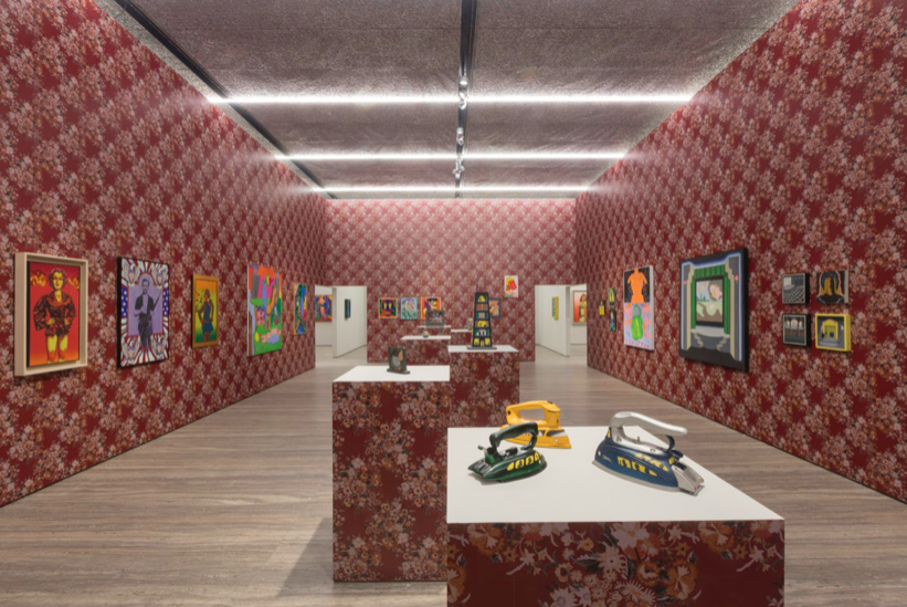
For the Art Center exhibition, The Hairy Who – and later their 1969 exhibition, Don Baum says ‘Chicago Needs Famous Artists’ at the Museum of Contemporary Art, Chicago – the artists covered the walls with a flower-patterned linoleum, with the express intention of having their audience experience the work in visually complex circumstances. For Fondazione Prada’s newly opened exhibition, Famous Artists from Chicago, the curator – and the Fondazione’s Artistic Director – Germano Celant mirrored the original setting.

On entering the gallery, you are met with a secondary route through to a room that has been built within the gallery walls, in which the group’s work is shown as a collective entity. A mass of wobbly, naked, fuzzy bodies; psychedelic stagings of suburbia; elaborate, flaming dreamscapes; and graphic expressions of delusion and dare; beyond the collective introduction, the exhibition peels off into individual sections, in considerably more ordered, traditional gallery settings. In doing so, each artist is given their moment at centre-stage, but the calm belies what was the strength of The Hairy Who: their focus on collective, noisy social commentary.

In an interview for the accompanying exhibition publication, Germano Celant spoke of how: “They did not passively accept reality like mechanical recorders in the manner of Warhol, but rather explored contemporary society with malice and irony.” He continues, “… they created visual subversions that contemplated the destruction of the body, and the ambiguity of existence leading to inhuman transformations. They focus solely on a moral argument, but attempt[ed] to push forward, awake and aware…”

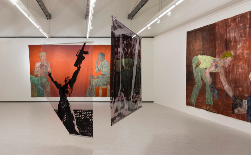
In the surrounding galleries, above and adjacent to Famous Artists from Chicago, Celant curated concurrent exhibitions of the work of Leon Golub and H. C. Westermann, both of whom lived and worked in Chicago after the second world war. Westermann, born in 1922, studied applied arts at the School of the Art Institute, Chicago, after serving in the U. S. Army as a Marine. Initially stationed in the South Pacific, and later in Korea, through his work Westermann recorded his traumatic experiences and anti-war politics. Working predominately in wood, in which he carved parts and images of boats, as well as assemblages and hallucinatory narratives, the forms in his work, as they are described in Celant’s essay in the exhibition catalogue: “oscillate between humour and ambiguity”. “On one hand, between a diving airplane and an atomic bomb, a penetrating penis and a figure with arms open in a gesture of surrender; and on the other, between a collapsing building and a book immersed in a void, heralding the end of the world and a return to the life of a savage.”

As is the case in Famous, the interior architecture of the Fondazione is utilised here, too. Westermann’s larger, sculptural works – in wood, metal and enamel – form a sort-of army, or front, defending the more revealing narrative works in wood and on paper, which are mostly hidden on entry. His practice embodies both a criticality of the brutality of war and its motivations, and a nostalgia for the fantastical stories of old Hollywood; and Westermann’s titles speak to that. They include, A Piece for the Museum of Shattered Dreams, Swingin’ Red King and the Silver Queen, Coffin for a Crooked Man and Where Angels Fear to Tread; and while his work is known for its craftsmanship, Westermann qualified in an interview with gallery director Martin Freedman and art critic Dennis Adrian in 1966, that: “To me craftsmanship is very secondary, actually”. “As I said, I like quality, but I like quality of ideas first, quality in politics, or quality in business. What the hell’s the difference?”

Golub’s concerns were rooted in his experience of American imperialism, but not limited to the conflicts the U.S had been involved with. He was equally interested in those that had gone unnoticed, developing timelines of concurrent wars and conflicts through his lifetime, and proving the interchangeability of the global paramilitary condition. In his installation works – where he manipulated and altered images of conflict, and presented them on layered photographic transparencies – Golub spliced recognised historical narratives, from the tragedies of the antiquity to the first televised war.

At the close of the second world war, figurative, expressionist practice was conflated with Socialist Realism and, particularly in the U.S, an aesthetic was sought that would assert the concepts of individual freedom and personal enterprise (i.e. The American Dream). This saw the onset of New Abstraction and Pop, and a so-called “depoliticised radical practice”. But Golub, as Celant describes: “Avoid[ed] the whisper in order to denounce loudly the terrible and dark situation in which the world itself.” And with H. C. Westermann, The Hairy Who, and countless other artists working outside of the New York School, he avoided the futile and the frivolous.

Although, “I would dare to claim that despite the apparent pessimism or negativity of the subject matter, in the reportage, retains a residual optimism”, as Golub said in 1996. “It’s in the very freedom to tell. In the freedom to make and exhibit these paintings.”

Originally published by Port.