
‘It’s almost a cliché that rock and roll musicians go for the fantasy, the gothic’ says Tom, a musician and artist who moved to the Royal Victoria Patriotic Building in the late 1980s. The former asylum was in the process of being restored and divided into flats, and ‘the fact that this building is absurdly decorative and impractical was one of the attractive things’.
It had been bought by Paul Tutton in 1980, who struck a deal with the Greater London Council even though, initially, they hadn’t wanted to talk to him at all. ‘It was one of those silly deals’, he says, where the GLC and Wandsworth Council were ‘just waiting for the building to fall down, because the land was worth more without it’. The council didn’t want to be responsible for maintaining listed buildings, and they agreed to lease the Royal Victoria Patriotic Building to him: ‘When we had done some restoration works, we paid £1 for the freehold.’
At the time, Paul — who founded the Covent Garden restaurant Tutton’s — had been supplying wine to the Royal College of Art. He was spending time in the Senior Common Room (the storied RCA staff area with candy pink leather sofas, solid silver salt and pepper shakers, and a wax figurine of David Hockney) mixing with artists, teachers, and their girlfriends and boyfriends, and it was through this crowd that he met the people who would become his tenants. Tom was one of them. ‘We bought it as an empty space in commission of the renovation. When I first saw the place there was no wooden floor. It was concrete, with broken windows, and pigeon poo everywhere.’
The Royal Victoria Patriotic Building was meant for a community of artists, makers, and musicians. There are workshop spaces — ‘which had woodworkers, and someone designing robotic arms’ — a theatre, a great hall, and a restaurant, which has been run by the same people since 1989. ‘There was an initial occupation by lots of interesting people’, Tom says. ‘It had the flavour of a creative common space, and this sense it was going to be crazy.’ But where the artists went, the lawyers and hedge fund managers soon followed. And although that feeling of creative spark diminished, the building kept its workshops, the drama school, and a handful of its original tenants.
There was an in-house architect leading the conversion of many of the flats, but Tom and his former wife went with a ‘superstar’ instead: ‘we did an art project’. Working with Eva Jiřičná — who designed Joe’s Cafe at the Joseph shop, the first Apple shop, and was part of the team working on the Millennium Dome — they designed a home built around her taste for cabling and glass. They got rid of the wooden beams, and replaced it with a sort-of mediaeval vaulting made of cables. In the original plans there was a glass catwalk that would join the two platforms at each end of the flat, but they opted to leave it open, and the platforms are now accessed by a metal staircase on one side and a ladder (or secret door) on the other.
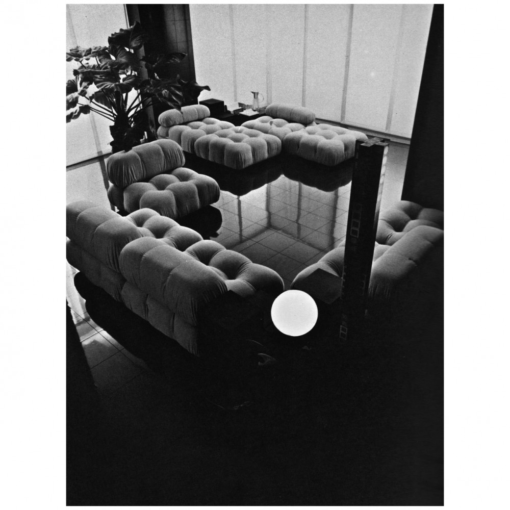
‘There was a time in the early days of the interior being finished, when I had a drink and I couldn’t figure out where to put the glass down’, Tom says. ‘It seemed just too well-worked-out, like putting a glass down would spoil the design. That made me feel uncomfortable, you’ve got to be able to hang loose.’ Over the years, the people living in the flat, what they need and want, has continued to change, growing around Jiřičná’s interior architecture. The kitchen was designed as an ‘entertainers kitchen’, a small space that could be closed off during parties. There was one big bedroom under the main bedroom that sits on an open platform above, which was later divided into a few smaller rooms when Tom and Lauren needed to accommodate their five children from two prior relationships. They had been living in New Zealand, where they met when Tom found Lauren taking wood from a skip, when they returned to London in 2005.
The flat became one big creative space, with Tom, Lauren and the kids making art together. ‘It was a lovely atmosphere’ Lauren says. ‘This place is like one great studio, you can work all over the house, the light is everywhere it’s fantastic.’ In 2012, one of the kids, Sofia, invited me over for dinner. We had met on our first day at the Royal College of Art, while looking for a desk in the labyrinthine studios. (Three houses knocked into one, with balconies that stood just one broken window lock away.) When me and Polly showed up at the building, we thought we had the wrong address because it looked like a castle. We spent the next two years up in the turret, cooking enough lasagne for 10 people by accident, sitting around the long dining table drawing, writing, painting, drinking pots of tea and bottles of wine, looking through books, lying on the floor laughing and/or crying, eating mangoes from Tooting market, watching the light shift throughout the day.
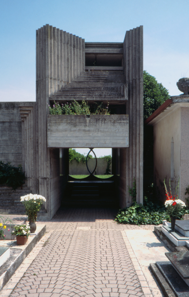
One night, Sofia told us a story about the cobbled courtyard in the back of the building, which undulates like a deep sea. During World War I, the building that had been designed as an asylum for ‘the Education and Training of three hundred Orphan Daughters of Soldiers, Seamen and Marines who perished in the Russian War, and for those who hereafter may require like succour’, was used as a troop hospital. Field shrapnel wounds would often go septic, because there were no antibiotics yet. Once people’s arms and legs were amputated, attendants would throw them into an old reservoir, which at the end of the war was cobbled over to become the courtyard. A few years ago someone enquired about levelling it, but the Ministry of Defence class it as a mass grave.
The building itself feels threatening, and there are many stories about it being haunted by orphans, soldiers, and potentially by Nazi spies who were shot in a square that is now a formal garden with a fish pond. Once, a former dancer for Prince showed up to work on an album with Tom, and she wouldn’t even go through the front door. ‘A lot of places carry history that’s unpleasant with them’ says Tom. ‘You just have to acknowledge it and get on with life.’
For the last few years, Tom and Lauren have mostly been living in France and New Zealand, and are in the process of packing up the flat to leave for good. ‘There are lifetimes here’, Lauren says. ‘That’s why it’s so difficult. It becomes so emotional, your connection to a place is so strong.’ There is no fine china at the flat, ‘a pointless waste of space’. Everything is used, interacted with, part of life. The furniture, objects, books, and art that animates the flat — including a collection of stuffed birds — has been made, collected and bought during various trips. During time spent living in different places, and time spent with different people who have been important to them at different times. During the stop-start process of packing up, they have got rid of things, packed the rest up, and then gone back in and edited what’s there. ‘I’m thinking, “Oh, I have a whole box of porcelain arms and legs from dolls,”’ Lauren says. ‘Do I really need that?’
At one point, after all their kids had left, and Tom and Lauren were mostly living abroad, Tom would use the flat as a rehearsal space with his band. ‘It’s essentially electronic music’ he says. ‘If we use ear monitors instead of speakers, we can have a full on rock and roll rehearsal in here and no one can hear it.’ Even then, the expansive dining table with its big, ceremonial-looking gothic chairs at either end and a long bench in between, has stayed in pride of place in the main living room. The furniture is purposefully “maximal”, jarring with the interior architecture, and moving away from its first iteration as a home, which was more stark. ‘I think we had a subconscious need to disrupt the planned space’, Tom says. ‘It was part of the past, and I wasn’t able to inhabit it anymore. We needed to fill it with things that weren’t meant to be here.’ To which, Lauren replies: ‘That’s when it becomes a home’.
It had been bought by Paul Tutton in 1980, who struck a deal with the Greater London Council even though, initially, they hadn’t wanted to talk to him at all. ‘It was one of those silly deals’, he says, where the GLC and Wandsworth Council were ‘just waiting for the building to fall down, because the land was worth more without it’. The council didn’t want to be responsible for maintaining listed buildings, and they agreed to lease the Royal Victoria Patriotic Building to him: ‘When we had done some restoration works, we paid £1 for the freehold.’
At the time, Paul — who founded the Covent Garden restaurant Tutton’s — had been supplying wine to the Royal College of Art. He was spending time in the Senior Common Room (the storied RCA staff area with candy pink leather sofas, solid silver salt and pepper shakers, and a wax figurine of David Hockney) mixing with artists, teachers, and their girlfriends and boyfriends, and it was through this crowd that he met the people who would become his tenants. Tom was one of them. ‘We bought it as an empty space in commission of the renovation. When I first saw the place there was no wooden floor. It was concrete, with broken windows, and pigeon poo everywhere.’
The Royal Victoria Patriotic Building was meant for a community of artists, makers, and musicians. There are workshop spaces — ‘which had woodworkers, and someone designing robotic arms’ — a theatre, a great hall, and a restaurant, which has been run by the same people since 1989. ‘There was an initial occupation by lots of interesting people’, Tom says. ‘It had the flavour of a creative common space, and this sense it was going to be crazy.’ But where the artists went, the lawyers and hedge fund managers soon followed. And although that feeling of creative spark diminished, the building kept its workshops, the drama school, and a handful of its original tenants.
There was an in-house architect leading the conversion of many of the flats, but Tom and his former wife went with a ‘superstar’ instead: ‘we did an art project’. Working with Eva Jiřičná — who designed Joe’s Cafe at the Joseph shop, the first Apple shop, and was part of the team working on the Millennium Dome — they designed a home built around her taste for cabling and glass. They got rid of the wooden beams, and replaced it with a sort-of mediaeval vaulting made of cables. In the original plans there was a glass catwalk that would join the two platforms at each end of the flat, but they opted to leave it open, and the platforms are now accessed by a metal staircase on one side and a ladder (or secret door) on the other.
‘There was a time in the early days of the interior being finished, when I had a drink and I couldn’t figure out where to put the glass down’, Tom says. ‘It seemed just too well-worked-out, like putting a glass down would spoil the design. That made me feel uncomfortable, you’ve got to be able to hang loose.’ Over the years, the people living in the flat, what they need and want, has continued to change, growing around Jiřičná’s interior architecture. The kitchen was designed as an ‘entertainers kitchen’, a small space that could be closed off during parties. There was one big bedroom under the main bedroom that sits on an open platform above, which was later divided into a few smaller rooms when Tom and Lauren needed to accommodate their five children from two prior relationships. They had been living in New Zealand, where they met when Tom found Lauren taking wood from a skip, when they returned to London in 2005.
The flat became one big creative space, with Tom, Lauren and the kids making art together. ‘It was a lovely atmosphere’ Lauren says. ‘This place is like one great studio, you can work all over the house, the light is everywhere it’s fantastic.’ In 2012, one of the kids, Sofia, invited me over for dinner. We had met on our first day at the Royal College of Art, while looking for a desk in the labyrinthine studios. (Three houses knocked into one, with balconies that stood just one broken window lock away.) When me and Polly showed up at the building, we thought we had the wrong address because it looked like a castle. We spent the next two years up in the turret, cooking enough lasagne for 10 people by accident, sitting around the long dining table drawing, writing, painting, drinking pots of tea and bottles of wine, looking through books, lying on the floor laughing and/or crying, eating mangoes from Tooting market, watching the light shift throughout the day.
One night, Sofia told us a story about the cobbled courtyard in the back of the building, which undulates like a deep sea. During World War I, the building that had been designed as an asylum for ‘the Education and Training of three hundred Orphan Daughters of Soldiers, Seamen and Marines who perished in the Russian War, and for those who hereafter may require like succour’, was used as a troop hospital. Field shrapnel wounds would often go septic, because there were no antibiotics yet. Once people’s arms and legs were amputated, attendants would throw them into an old reservoir, which at the end of the war was cobbled over to become the courtyard. A few years ago someone enquired about levelling it, but the Ministry of Defence class it as a mass grave.
The building itself feels threatening, and there are many stories about it being haunted by orphans, soldiers, and potentially by Nazi spies who were shot in a square that is now a formal garden with a fish pond. Once, a former dancer for Prince showed up to work on an album with Tom, and she wouldn’t even go through the front door. ‘A lot of places carry history that’s unpleasant with them’ says Tom. ‘You just have to acknowledge it and get on with life.’
For the last few years, Tom and Lauren have mostly been living in France and New Zealand, and are in the process of packing up the flat to leave for good. ‘There are lifetimes here’, Lauren says. ‘That’s why it’s so difficult. It becomes so emotional, your connection to a place is so strong.’ There is no fine china at the flat, ‘a pointless waste of space’. Everything is used, interacted with, part of life. The furniture, objects, books, and art that animates the flat — including a collection of stuffed birds — has been made, collected and bought during various trips. During time spent living in different places, and time spent with different people who have been important to them at different times. During the stop-start process of packing up, they have got rid of things, packed the rest up, and then gone back in and edited what’s there. ‘I’m thinking, “Oh, I have a whole box of porcelain arms and legs from dolls,”’ Lauren says. ‘Do I really need that?’
At one point, after all their kids had left, and Tom and Lauren were mostly living abroad, Tom would use the flat as a rehearsal space with his band. ‘It’s essentially electronic music’ he says. ‘If we use ear monitors instead of speakers, we can have a full on rock and roll rehearsal in here and no one can hear it.’ Even then, the expansive dining table with its big, ceremonial-looking gothic chairs at either end and a long bench in between, has stayed in pride of place in the main living room. The furniture is purposefully “maximal”, jarring with the interior architecture, and moving away from its first iteration as a home, which was more stark. ‘I think we had a subconscious need to disrupt the planned space’, Tom says. ‘It was part of the past, and I wasn’t able to inhabit it anymore. We needed to fill it with things that weren’t meant to be here.’ To which, Lauren replies: ‘That’s when it becomes a home’.