
Hippie Modernism: The Struggle for Utopia examined the intersections of art, architecture and design with the counterculture of the 1960s and early 1970s. Shown at the Walker Art Center, Minneapolis earlier this year, the exhibition was loosely organised around Timothy Leary’s famous mantra, “Turn On, Tune In, Drop Out” and charted the social, cultural and professional revolutions of the period.
The catalogue accompanying the exhibition goes further still, considering practices of radical architecture and anti-design movements that emerged through Europe and North America, as well as the print revolution and new forms of theatre and radical politics. Here we speak with the show curator and editor, Andrew Blauvelt, about the work and impact of the critically under-served movement.
Q: Although art and culture has been so clearly influenced by this period, there have been few major museum shows documenting the counterculture. Why do you think this is, and what did you hope to achieve in Hippie Modernism?
There have been many more focussed shows on discrete aspects of the period, which has really come into art historical fashion over the last decade or so. But generally speaking most major museums wouldn’t touch the material because it’s not squarely in the art camp, or the art canon of the period. Too much “ephemera,” or what we call graphic design.
When we think of the 1960s we typically associate it with many of the other important movements: Pop, Conceptualism, Land Art, Body Art, Minimalism, etc. By doing Hippie Modernism I hoped to focus more attention on these highly experimental practices, and by doing so open new spaces for understanding work from the period that didn’t conform to the canonical narrative. Just as we search for evidence of modernism in far flung geographies now, we can also look at the overlooked closer to home.
Q: Could you elaborate on the term “hippie modernism”?
It seems to be an oxymoron, mostly because of what we think modernism is or was supposed to be. I was attracted to this essential conundrum. However, in the course of making the show and the book it became clearer that the term in fact embodies the contradictions of what would later become known as postmodernism (a critique of modernism). And from today’s vantage point, it might be considered simply as “another modernism,” alternate ways of making art, using technology, and shaping society.
Q: In the introduction to the book you mention the shared sense of struggle and need to “start from zero” in the hippie counterculture and modernism. Although elements of culture and technology have progressed in many ways, we are still bound to the problems and hopes of the period, and much of what is discussed in the book and exhibition still rings true today.
Oh yes: climate change, Black Lives Matter to take just two major examples. Progress can be glacial. Struggle seems eternal. We still struggle for our own utopia. I did not want to buy into the failure narrative of the 1960s, which was after all a history underwritten by the conservative political victories of the 1980s. In my opinion, that victory was fleeting as culture continued on a trajectory set into motion during the 1960s. The struggles continue in no small part because the system transfigures its themes and ambitions. For instance, the communalism of the 1960s has been recast as the sharing economy today: couch surfing becomes Air B&B, and so on.
Q: “Stay hungry. Stay foolish”, a phrase published in the Whole Earth Catalogue, was very much key to the counterculture but has now been adopted by Silicon Valley entrepreneurs after Steve Jobs used it in a commencement speech. There is incredible irony in this, when you look back at the ideas of the period – it’s also interesting to consider that the tech industry might now see itself as a counterculture.
Ah, the catchphrase of the entrepreneur. We should remember that in the 1960s computing was the province of large corporations, big government, and the military. The countercultural dream was for personal computing. That computers (and portable video and even television too) could be radically democratic tools to unleash individual creativity and connect people. This was a revolutionary idea. Jobs and Gates were the beneficiaries of this revolution, Zuckerberg and Brin must contend with its legacy.
The cross-disciplinary nature of the work of the counterculture led to what could amount to a whole “lifestyle” – as embodied by Stewart Brand’s Whole Earth Catalogue, would you say that in some ways what was being made was a sort of active sketch of what is possible?
Yes. I say in the book that the counterculture was so successful in its moment because it actively ‘prototyped’ the future it wanted to live. If you want sexual liberation you must live it now not simply ask for it, for instance. Don’t want to work 9-5 in a soulless job, then invent a world or counter economy in which you don’t. Even if it fails, it provides a glimpse and a taste of what is possible and that has more lasting consequence and value.
These ideas have become creatively recharged and recast today, and the point is not about claims to originality but rather ideas of continuity. Why does this past look particularly appealing today?
Q: The architectural group Archigram were one who so brilliantly predicted the tethering of our bodies to digital devices, examples including the Electronic Tomato and Info-Gonks – were you surprised by any of the predictions you came across in your research?
Always. Info-Gonks as Google Glass. The Provo legacy project of the Witkar—an electric car sharing program in Amsterdam in the 1970s and 1980s. Archigram’s Room of a 1000 Delights as virtual reality. Superstudio’s Supersurface as Internet. Heineken’s World Bottle: a glass beer bottle as an upcycled building brick. The Videofreex Lanesville TV project, which prefigured community television and “user-contributed content.” Ant Farm’s Truckstop Network and YouTube. It was a visionary period.
Q: Publishing had a really interesting role, particularly in the sense that it very much took on the idea of the role of publishing as creating or being for a public, which magazines would you say exemplify the time?
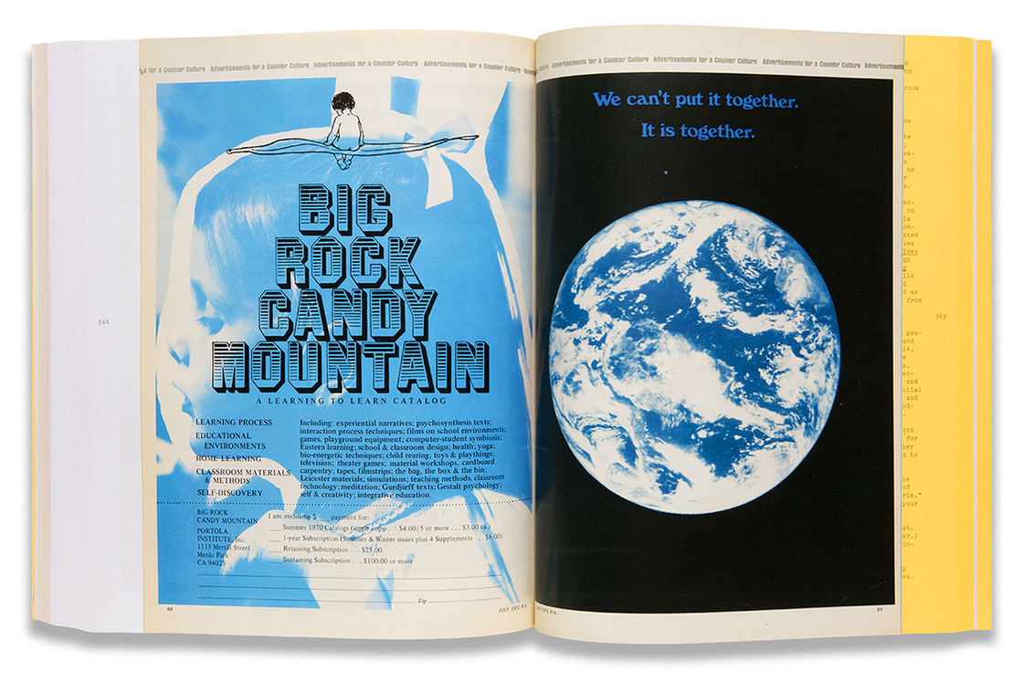
Three come to mind and are in the show. Aspen, “the magazine in a box,” which was a thematic publication with a unique art director for each issue. It was an assemblage of material and media: pamphlets, posters, loose images, flexidisks, film and music reels—the message in multiple media. The other discovery was Scanlan’s, art directed by the incredible Barbara Stauffacher Solomon, who was famous for her supergraphics. It was a muckraking-type journal, which gave the world gonzo journalism and was the first to call for the impeachment of Richard Nixon. Both were essentially forced out of business ostensibly because they did not conform to postal regulations or were blacklisted by printers. Oz magazine broke ground on both the design and content front. It was subject to censorship.
The book is not like a traditional exhibition publication, in that its focus is on the subject rather than being a record of the show specifically. Could you elaborate on your thinking when putting the book together?
I worked with Emmet Byrne, the design director at the Walker, on the book’s design. We share similar concerns when making a book, on the one hand we are inspired by the content and the period yet we do not want to create a simulation of it. We hope to create something fresh and new but also something that could not have been made without having been influenced by its content.
Materially, physically, it is a mash-up of the heft of a Whole Earth Catalog (including its form as a paperback) and the colouring of the People’s Yellow Pages (a telephone book of free things in the Bay Area). Our initial plan had been to use Helvetica, which was truly revolutionary at that time, but once you see Scanlan’s typography there’s no point trying to emulate that. We needed more hippie in the mix. For the sake of time, we didn’t use rubber stamp type, although it was very tempting. The typewriter and Cooper were deployed instead.
The funky silver paper with color and black and white repros is pure Emmet. These pages function like “ads” for different works in the show, sometimes they simply recreate an actual ad, but often they are fabricated. Here we also diversified the typographic and stylistic palette, Day-Glo was invented in the Bay Area and it hadn’t really been exploited until this period, hence the fluorescent yellow.
My idea was to include the facsimile reprint of “Advertisements of a Counter Culture” that first appeared in Progressive Architecture magazine (and presumably got the editor fired). I wanted to riff on this idea of making ads for a counter culture and extend it. I wish we had time and space to make more of them.
What should the reader take from the use of Buckminster Fuller and Shoji Sadao’s US Pavilion for Expo 67 caught in flames as the cover image?
Well, when the dome burned in 1976, the bicentennial of the United States, it seemed to signify the end of the countercultural era. All those dreams go up in flames. Or do they? From the ashes of the dome (the metal lattice structure survived, the plastic coating melted away), a museum of the biosphere rose inside it. That seemed like an interesting way to think of the fate and future of hippie modernism.
April, 2016
The catalogue accompanying the exhibition goes further still, considering practices of radical architecture and anti-design movements that emerged through Europe and North America, as well as the print revolution and new forms of theatre and radical politics. Here we speak with the show curator and editor, Andrew Blauvelt, about the work and impact of the critically under-served movement.
Q: Although art and culture has been so clearly influenced by this period, there have been few major museum shows documenting the counterculture. Why do you think this is, and what did you hope to achieve in Hippie Modernism?
There have been many more focussed shows on discrete aspects of the period, which has really come into art historical fashion over the last decade or so. But generally speaking most major museums wouldn’t touch the material because it’s not squarely in the art camp, or the art canon of the period. Too much “ephemera,” or what we call graphic design.
When we think of the 1960s we typically associate it with many of the other important movements: Pop, Conceptualism, Land Art, Body Art, Minimalism, etc. By doing Hippie Modernism I hoped to focus more attention on these highly experimental practices, and by doing so open new spaces for understanding work from the period that didn’t conform to the canonical narrative. Just as we search for evidence of modernism in far flung geographies now, we can also look at the overlooked closer to home.
Q: Could you elaborate on the term “hippie modernism”?
It seems to be an oxymoron, mostly because of what we think modernism is or was supposed to be. I was attracted to this essential conundrum. However, in the course of making the show and the book it became clearer that the term in fact embodies the contradictions of what would later become known as postmodernism (a critique of modernism). And from today’s vantage point, it might be considered simply as “another modernism,” alternate ways of making art, using technology, and shaping society.
Q: In the introduction to the book you mention the shared sense of struggle and need to “start from zero” in the hippie counterculture and modernism. Although elements of culture and technology have progressed in many ways, we are still bound to the problems and hopes of the period, and much of what is discussed in the book and exhibition still rings true today.
Oh yes: climate change, Black Lives Matter to take just two major examples. Progress can be glacial. Struggle seems eternal. We still struggle for our own utopia. I did not want to buy into the failure narrative of the 1960s, which was after all a history underwritten by the conservative political victories of the 1980s. In my opinion, that victory was fleeting as culture continued on a trajectory set into motion during the 1960s. The struggles continue in no small part because the system transfigures its themes and ambitions. For instance, the communalism of the 1960s has been recast as the sharing economy today: couch surfing becomes Air B&B, and so on.
Q: “Stay hungry. Stay foolish”, a phrase published in the Whole Earth Catalogue, was very much key to the counterculture but has now been adopted by Silicon Valley entrepreneurs after Steve Jobs used it in a commencement speech. There is incredible irony in this, when you look back at the ideas of the period – it’s also interesting to consider that the tech industry might now see itself as a counterculture.
Ah, the catchphrase of the entrepreneur. We should remember that in the 1960s computing was the province of large corporations, big government, and the military. The countercultural dream was for personal computing. That computers (and portable video and even television too) could be radically democratic tools to unleash individual creativity and connect people. This was a revolutionary idea. Jobs and Gates were the beneficiaries of this revolution, Zuckerberg and Brin must contend with its legacy.
The cross-disciplinary nature of the work of the counterculture led to what could amount to a whole “lifestyle” – as embodied by Stewart Brand’s Whole Earth Catalogue, would you say that in some ways what was being made was a sort of active sketch of what is possible?
Yes. I say in the book that the counterculture was so successful in its moment because it actively ‘prototyped’ the future it wanted to live. If you want sexual liberation you must live it now not simply ask for it, for instance. Don’t want to work 9-5 in a soulless job, then invent a world or counter economy in which you don’t. Even if it fails, it provides a glimpse and a taste of what is possible and that has more lasting consequence and value.
These ideas have become creatively recharged and recast today, and the point is not about claims to originality but rather ideas of continuity. Why does this past look particularly appealing today?
Q: The architectural group Archigram were one who so brilliantly predicted the tethering of our bodies to digital devices, examples including the Electronic Tomato and Info-Gonks – were you surprised by any of the predictions you came across in your research?
Always. Info-Gonks as Google Glass. The Provo legacy project of the Witkar—an electric car sharing program in Amsterdam in the 1970s and 1980s. Archigram’s Room of a 1000 Delights as virtual reality. Superstudio’s Supersurface as Internet. Heineken’s World Bottle: a glass beer bottle as an upcycled building brick. The Videofreex Lanesville TV project, which prefigured community television and “user-contributed content.” Ant Farm’s Truckstop Network and YouTube. It was a visionary period.
Q: Publishing had a really interesting role, particularly in the sense that it very much took on the idea of the role of publishing as creating or being for a public, which magazines would you say exemplify the time?
Three come to mind and are in the show. Aspen, “the magazine in a box,” which was a thematic publication with a unique art director for each issue. It was an assemblage of material and media: pamphlets, posters, loose images, flexidisks, film and music reels—the message in multiple media. The other discovery was Scanlan’s, art directed by the incredible Barbara Stauffacher Solomon, who was famous for her supergraphics. It was a muckraking-type journal, which gave the world gonzo journalism and was the first to call for the impeachment of Richard Nixon. Both were essentially forced out of business ostensibly because they did not conform to postal regulations or were blacklisted by printers. Oz magazine broke ground on both the design and content front. It was subject to censorship.
The book is not like a traditional exhibition publication, in that its focus is on the subject rather than being a record of the show specifically. Could you elaborate on your thinking when putting the book together?
I worked with Emmet Byrne, the design director at the Walker, on the book’s design. We share similar concerns when making a book, on the one hand we are inspired by the content and the period yet we do not want to create a simulation of it. We hope to create something fresh and new but also something that could not have been made without having been influenced by its content.
Materially, physically, it is a mash-up of the heft of a Whole Earth Catalog (including its form as a paperback) and the colouring of the People’s Yellow Pages (a telephone book of free things in the Bay Area). Our initial plan had been to use Helvetica, which was truly revolutionary at that time, but once you see Scanlan’s typography there’s no point trying to emulate that. We needed more hippie in the mix. For the sake of time, we didn’t use rubber stamp type, although it was very tempting. The typewriter and Cooper were deployed instead.
The funky silver paper with color and black and white repros is pure Emmet. These pages function like “ads” for different works in the show, sometimes they simply recreate an actual ad, but often they are fabricated. Here we also diversified the typographic and stylistic palette, Day-Glo was invented in the Bay Area and it hadn’t really been exploited until this period, hence the fluorescent yellow.
My idea was to include the facsimile reprint of “Advertisements of a Counter Culture” that first appeared in Progressive Architecture magazine (and presumably got the editor fired). I wanted to riff on this idea of making ads for a counter culture and extend it. I wish we had time and space to make more of them.
What should the reader take from the use of Buckminster Fuller and Shoji Sadao’s US Pavilion for Expo 67 caught in flames as the cover image?
Well, when the dome burned in 1976, the bicentennial of the United States, it seemed to signify the end of the countercultural era. All those dreams go up in flames. Or do they? From the ashes of the dome (the metal lattice structure survived, the plastic coating melted away), a museum of the biosphere rose inside it. That seemed like an interesting way to think of the fate and future of hippie modernism.
April, 2016
All text originally published by itsnicethat.com. All images courtesy of magazine and artist. All text copyright Billie Muraben.