It’s Nice That

Eduardo Paolozzi: On a Singular Teacher and His Devil-May-Care Philosophy

“It’s the one with the red motorcycle outside” said David Queensberry as he gave directions to his west London home. The former head of ceramics at the Royal College of Art, and trustee of The Paolozzi Foundation had agreed to meet to reminisce on Paolozzi’s time as a tutor at the RCA…

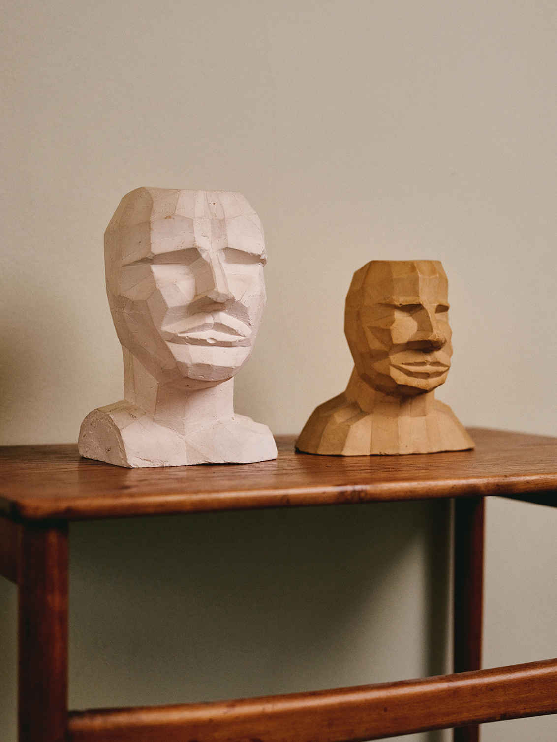
Eduardo Paolozzi maquettes, photographed by Jamie Stoker
“It’s the one with the red motorcycle outside” said David Queensberry as he gave directions to his west London home. The former head of ceramics at the Royal College of Art, and Trustee of The Paolozzi Foundation had agreed to meet to reminisce on Paolozzi’s time as a tutor at the RCA, after we were introduced by Neil Parkinson, the college’s archivist.


His house is dotted with masterworks, from archive Paolozzi sculptures, to maquettes, ceramics and prints that adorn the walls of almost every room; as well as his own ceramics, and a vast collection of antique and contemporary pieces. When we returned to photograph his collection of Paolozzi’s work, there were recently returned pieces from the Whitechapel show, leant against sofa cushions, beside fruit bowls on the dining table and stacked behind a dolls house and pile of books.


As Aristotle the cat splayed himself prominently across an Eames footstool, we sat with cups of tea in Paolozzi mugs, and Queensberry started at the beginning. “It just so happened that Eduardo, who was a rather famous artist by then, was also one of my best friends. So I said to him, ‘What do you think about working for a bit at the college? It’s a nice environment, and you can do your own thing there’. He said yes, so he shipped up and started coming in. He had a glorious presence, some people found him rather difficult, other people, quite magical.”


In 1959, when David Queensberry was appointed head of ceramics at the RCA, the college had been through an overhaul of approach. “Since 1948, when Robert Darwin took over as rector, there was a drive to go back to its roots and be primarily concerned with design,” Queensberry explains. With his appointment came the decision that “this ought to change, the college’s approach to ceramics should be on a wider spectrum. From pre-Ice Age figurative sculpture, to mugs and high technology ceramics; as well as works that didn’t have any umbilical connection with a pot—objects, or artworks.” The design part Queensberry could handle. “I had great experience in the industry, but we were taking on these students who needed something else.” That’s where, and when, Eduardo Paolozzi came in.

“Eduardo wouldn’t give traditional advice. He wouldn’t say ‘Why does the handle on that cup have such a pedestrian angle?’ Instead he’d ask ‘Why do you need a handle on a cup at all? The Japanese don’t.’ He’d bring in portfolios full of the collage material he’d been working with, and hand it out to people. He could be very, very good for certain students, he was like a conjurer, he could pull a rabbit out of a hat.”


Paolozzi would invite students for dinner at the Meridiana, a now long gone Italian restaurant in South Kensington, where “he had given the guy all these sculptures for their terrace, in exchange for unlimited credit at the restaurant. We’d have a huge table, the students would be wined and dined, and sometimes things would go a bit wrong – he had quite a short attention span, and if he got bored with things, he’d leave abruptly.”


A regular guest at the Meridiana, was product designer Robin Levien, a former student and assistant of Paolozzi’s. Levien recalls: “He was one of my tutors, but tutor in an unconventional sense. We didn’t have formal meetings or tutorials, it was more that he was around. There was one occasion where Paolozzi told a student, ‘Come and see me at my studio at Dove House Street tomorrow’, she said ‘Fine, what time should I come?’ And he told her to arrive at 8am, probably quite provocatively to suggest she ought to be up early if she wants to be a serious artist. So she arrives at 8am, presses the buzzer and just as the door opens, three dwarves came out. When she arrived upstairs, nothing was said.”

“I always thought of Eduardo of a bit of an enigma, he’d be giving things away all the time, but it was surprisingly difficult to give him anything,” Levien continues. “It was a way of keeping everybody at a distance—it adds a performative quality to relationships—and it kept him in control” says Levien. “I got to know him reasonably well, because he was interested in my work. He offered to buy some a few weeks before my degree show, and I said: ‘Eduardo, OK, but I’d rather see how things go at the show before saying yes’. And unlike my BA show, I didn’t sell anything—it was all a bit academic, a bit cerebral—so afterwards I asked if he’d still be interested in buying my work, and Eduardo said: ‘No, too late.’ It was a great lesson about not looking a gift-horse in the mouth…”.


After graduating, Levien returned to the RCA to assist David Queensberry, who ran his ceramics business from the college. “I was still around a bit, and so was Eduardo, and on one day I came back from a job interview with Terrence Conran, which David had recommended me for, and was telling Eduardo about it. All he said was: ‘Another one of my failures’, which was really his sense of humour. Eduardo had taught Terrence at the Central, I suppose it was because he had gone into design and not art.”

“Eduardo would be in the interviews, as would some of the students. There was one occasion where, after the interviewee had left, he just remarked: ‘Evening class, not collected.’ It doesn’t get worse than that, does it? He was very sharp, very succinct”, recalls Levien. “He had a wicked streak too. There was one occasion when he bet a girl in my year £100 to streak around the Albert Hall, and that was a lot of money in the 70s. So half the ceramics department went down to the lobby, she took off her coat and ran, and when she came back to the double doors, he wouldn’t open them! He did give her the £100, though.”


That wicked streak ran through to his dealings with the art world, “When he had the Tate exhibition in 1971, which had probably been his biggest show to date, he suddenly became popular on another level”, says Levien. “The story goes that a couple of rich American women came to his studio—and a lot of the things he was doing at the time were tables with objects on top. He would make the works in wax and if someone wanted to buy one, it would be cast in bronze—and these women were gushing about how fabulous everything was, ‘We love it, it looks so great’ [said in a fittingly exaggeratedly gushy American accent], and then they got around to the price. I don’t remember the exact figures, it might have been something like, ‘it’s £10K’, at which point they said: ‘Oh dear, Eduardo, that’s a little more than we’d really want to spend’. So he took a couple of steps back, went at it, and kicked a lump of wax off the top of the work. ‘OK, that’ll be £8K’, he said. He might as well have just kicked them right up the backside.”

“He never really had a good relationship with an art dealer”, remarks Queensberry, “he was suspicious of them. Of course, it didn’t help him. He was prolific, and varied, there’s no obvious theme, and in a lot of ways, Eduardo’s work is difficult. He stood for something different. His work is alarming, the opposite to decorative”, he says. “A lot of work was left unsigned, and he was always giving it away – no good keeping it in the drawer forever.”


One such instance led to a strange incident involving the exhibition of a series of erotic collages, supposedly attributed to Paolozzi. “Francis Morland, who was a sort-of wannabe artist in the 50s, had latched on to Eduardo”, remembers Queensberry. “He was quite rich—his family ran a business that made sheepskin coats in the West Country—and he built a primitive foundry, in which he made primitive castings. He then went on to get heavily involved with drugs, spending eight years in prison in America when he was apprehended with a massive haul while sailing his yacht.”

“Then about two years ago, a London gallery held an exhibition of Paolozzi’s erotic art. And I, not only I, but a lot of us were pretty bloody sure that he didn’t do it. Not with a view to protecting him, but just on an analytical basis of what we knew he had done. I was Popzi’s best friend, somebody would’ve seen it, something, ‘Just a joke David’, anything. But there was nothing”, remarks Queensberry.

“We then started to analyse the work and were convinced that Francis Morland had done them. We knew that Eduardo had given him a lot of collage material he had used, so Morland would have had a lot of stuff. But the big issue was the signature, Eduardo would often leave his work unsigned. But we got them in the end, the auction houses wouldn’t take them and the gallery had to refund their sales, so we did succeed there.”


Paolozzi had a knack for attracting eclectic groups of people. “He had a way – he was not a social climber at all, people found him rather interesting. He seemed from another world, and he was hugely likeable”, remembers Queensberry. “He was curiously childlike, in a way” says Levien. “Life was entertaining and amusing with Eduardo, he had a fantastic group of people around him, and he’d invite you along to parties. He’d take the role of entertainer, and whether it was all totally genuine or there was an element of bullshit there I don’t know. But I’d forgive him that. You make allowances – never let the truth get in the way of a good story.”


Nicole Fahri met Paolozzi when she was casting her first sculpture work at the RCA’s foundry. “He came around next to me and we started chatting. He invited me to his studio, then he came to see me at home, and little by little, we became very close friends”, she recalls, as we settled down to talk in her studio, which is sheltered among the trees at the far end of her garden.


Fahri had been taking classes with the sculptor Jean Gibson, who taught her how to cast: “She was very much about theory, and when she didn’t like something, if I thought it was not bad, I would bring it home to show Eduardo. By then he was coming for lunch or dinner, and he was very encouraging. Eduardo would teach you to decide for yourself whether your work is good or not. He would say that you are the better judge, and no one could tell you that what you are doing is crap”, she says. “Eduardo taught me how to see, how to concentrate and discover things.”


When Fahri met her husband, the playwright David Hare, she stopped making work for a year: “Eduardo kept saying, ‘Love doesn’t suit your art’, and he decided to come once a week to my studio. He suggested I stop working in clay to get ‘a new buzz’, and I will never forget the day he taught me how to sculpt with wax. He would sit at one end of the table, and I at the other, and for six months we would work. At the end, I went back to clay, which was what he wanted, for me to go back to working.”


It was difficult for Paolozzi to be around people who weren’t excited by life, “Many times, when after dinner had ended he was not enjoying the conversation, he would stand up and say, ‘Who is taking me home?’ He would break the party, that was it. But that was Eduardo, he could be the way he wanted to be, I didn’t care,” Fahri smiles.

“If he really liked you he wouldn’t let you go, but a lot of people who he met throughout his life did not stand the test of time. He would fall in love quickly, and then you had to keep him interested—in what you were doing, or what you were saying—otherwise he would get bored. He couldn’t stand small talk.”

“With me, there were no problems. He’d sit at the end of the table, taking the whole side, so jolly and happy”, Fahri recalls. “When David and I got married, he was my witness. My father had died and he said, ‘I will be your Dad’. He really was like a father, he’d come to my house with his friends and I would cook for him, my home was open to him. We became a big family, because Eduardo was gregarious. He liked people to meet, he always enjoyed big parties and his friends becoming friends.”


Fahri’s home is testament to that, with Paolozzi’s presence felt around every corner. From works lining the walls, to small casts of animals from Noah’s Ark as bookends, and giant feet as doorstops; massive pink ceramic hats sit under side-boards, notes and photographs are slotted into frames and prints are racked up in the downstairs loo and run along the staircase.

“We would celebrate his birthday in our garden. I’d take out all the plaster works that he’d given me, put them out in the garden and we would have a party” says Fahri. “And he was interested in everything, theatre, design, music. The house became like a salon, it was so joyful, a beautiful life. I have a friend who is a flutist, they would play music, and Eduardo would be sat at the end of the table. The king of the party.”


Everything about Paolozzi was larger than life, “He had a big voice and big hands, he’d embrace you and kiss you on the mouth,” Fahri remembers. “Everything about him, his appetite, everything, was charismatic. People who are so open to the world, so giving, of course you are drawn to them. You go towards them, because they open your life, they open your world. It’s a great gift that he had, to be giving all the time. The whole of himself, his knowledge.”

July, 2017

All text originally published by itsnicethat.com. All images courtesy of magazine and artist. All text copyright Billie Muraben.

It’s Nice That

An Exercise in Style: Interviewing John Morgan

As we ascend the stairs from his subterranean studio, our conversation turns to the subject of design writers. “Are there any? And if there are, why?” A point of contention is, if they do exist, “can [they] write about a subject other than design in an interesting way…

By Jack Davison
As we ascend the stairs from his subterranean studio, our conversation turns to the subject of design writers. “Are there any? And if there are, why?” A point of contention is, if they do exist, “can [they] write about a subject other than design in an interesting way, and is there not someone else who could do it better?” This emphasis on quality is an important one, and something that defines the often indefinable work of John Morgan Studio.


Founded in 2000, the studio has and continues to work with renowned artists, architects and cultural institutions including Four Corners Books, David Chipperfield Architects, Art Review and Tate Britain. A recent project is Pierre’s, the inaugural issue of New York’s The Artist’s Institute magazine. The principle of The Magazine is to take each season at the institute as a point of departure for journalism, fiction, interviews and visual projects to be developed around the work of the exhibiting artist. This season it’s Pierre Huyghe and the issue features topics including science fiction and philosophy, alongside fake adverts designed by John’s newly formed and slightly fictitious London/New York agency Vault Six. Another recent project was their review of the signage and way-finding at Tate Britain. The studio designed a new display typeface; a scheme for the templates of maps, menus, banners and posters; captions, maps and threshold dates cast in metal and sign-painted onto the walls and floor. In the synopsis of the project the process was described as “reducing the presence of signs and promotional material to an ‘essential only’ state… the requirements for a gallery like this [mean] the signage could be less present and more dignified”.


As well as his design practice, John has run projects at a number of design schools over the last 15 years, and the recent history of art education is something of a concern. “It shouldn’t be a transactional relationship” he says, “it’s an issue for tutors and students, and the worst educational model. Survival of the fittest is fine, but not in an education environment. Those who will do well, the people who have the confidence to reach out, will thrive, but they always will. It’s people who come to London, go into college once a week and then back off to bedsit land god knows where, what’s their experience?”


We’ve crossed the street from the studio and sat for lunch at a brasserie close-by. “It’s a nice way to eat, although it’s a faux interior, the element of nostalgia tricks you” John says. “They did certain things very well at the turn of the century – the theatre of it all, the settings and the tablecloths.” In a way, such details are a visualisation of the references and intentions of the people who run the brasserie, and how they want to communicate with their audience. On that subject John says “My real audience is the author or artist I’m working with, and myself. To try to second guess anything else often ends in tears. Like the focus group for a film, a real auteur wouldn’t care and has a focus group ever improved a film? Unlikely.”

“Anyway, books aren’t products, it’s a different territory.” Describing his work with Four Corners Books he says: “sometimes you’re a cinematographer, sometimes a director and then all that falls in between. For most of the Familiars series the artist has chosen the book, so it means something to them and that can be conveyed very subtly or in a more overt way. Sometimes we make a fully integrated object and in other instances the artist will produce photographic or illustrative plates.” Although they don’t often commission illustration, “I think I have a phobia of it because there is such a specific voice”, John says. “When you get something back you have to work with that and it can be far from what you had in mind. I love the illustrations in The New Yorker, there they work perfectly well. With photography you can direct a lot more, and the evidence of the hand is a little less present.”


The question of style is an important one, and in his work John aims more for a sense of atmosphere, for want of a better word. In a conversation with eye magazine’s editor John Walters he described it as “a problematic and woolly word, but it’s the best description of what I aim for in my work. It’s the sensation you find when you walk into a building or space and it changes the way you feel… It’s hard to define what gives a book atmosphere, because it can be found in unexpected places, and many books by attentive designers lack it, but you know it when you see it or feel it.”


At this point our conversation shifts, “without being too self-reflective” John says, “I like the idea of you writing this under the construct of this situation, it’s more fun. Ideally just do the whole thing without even mentioning graphic design directly. Do the whole thing about food – who wants to read about graphic design anyway? I’d rather be reading a novel or something, the more literary this can be the better.” So I ask him what he is reading, “Michel Houellebecq, everything by him. People say he’s a misogynist but I don’t see it that way, a misanthrope maybe – but not that either. In Submission the character is an academic who takes on religion as more of a lifestyle choice than one of faith, like people who send their kids to a Church of England school because it’s the better option, this professor works in a Muslim school because the pay and lifestyle is better for him. Houellebecq is so brutally honest, it’s horrific. I’m also reading Maggie Nelson’s The Argonauts, best described as a love story. The author records her life, falling for a transgender artist, her pregnancy and the shifts in their own bodies as well as the relationship itself. Both Nelson and Houellebecq are equally uncompromising in their own way.”


Maggie Nelson also wrote the text for Carolee’s, the forthcoming issue of the magazine of The Artist’s Institute (with Carolee Schneemann and published later this year), designed by John Morgan studio. I ask him whether he sees himself continuing to focus on publishing, or to look more to expanding on projects such as the branding of the city of Llubijana: “working with architects, they have a much greater control of space and influence than we do, but still not the impact you’d imagine, for that you probably need to get into politics or government. And as a designer you can only make a very slight imprint, I think I will continue to work with small gestures” Although, whether he’ll stick to that is another matter: “I have this relationship with fashion where sometimes I think it’s the most beautiful thing in the world and sometimes I think it’s ridiculous. And it’s totally okay to think the opposite one day to the next, we are made up of compound sensibilities.”

July, 2016

All text originally published by itsnicethat.com. All images courtesy of magazine and artist. All text copyright Billie Muraben.

Royal College of Art

Head, Heart & Hand: The Greenhouse

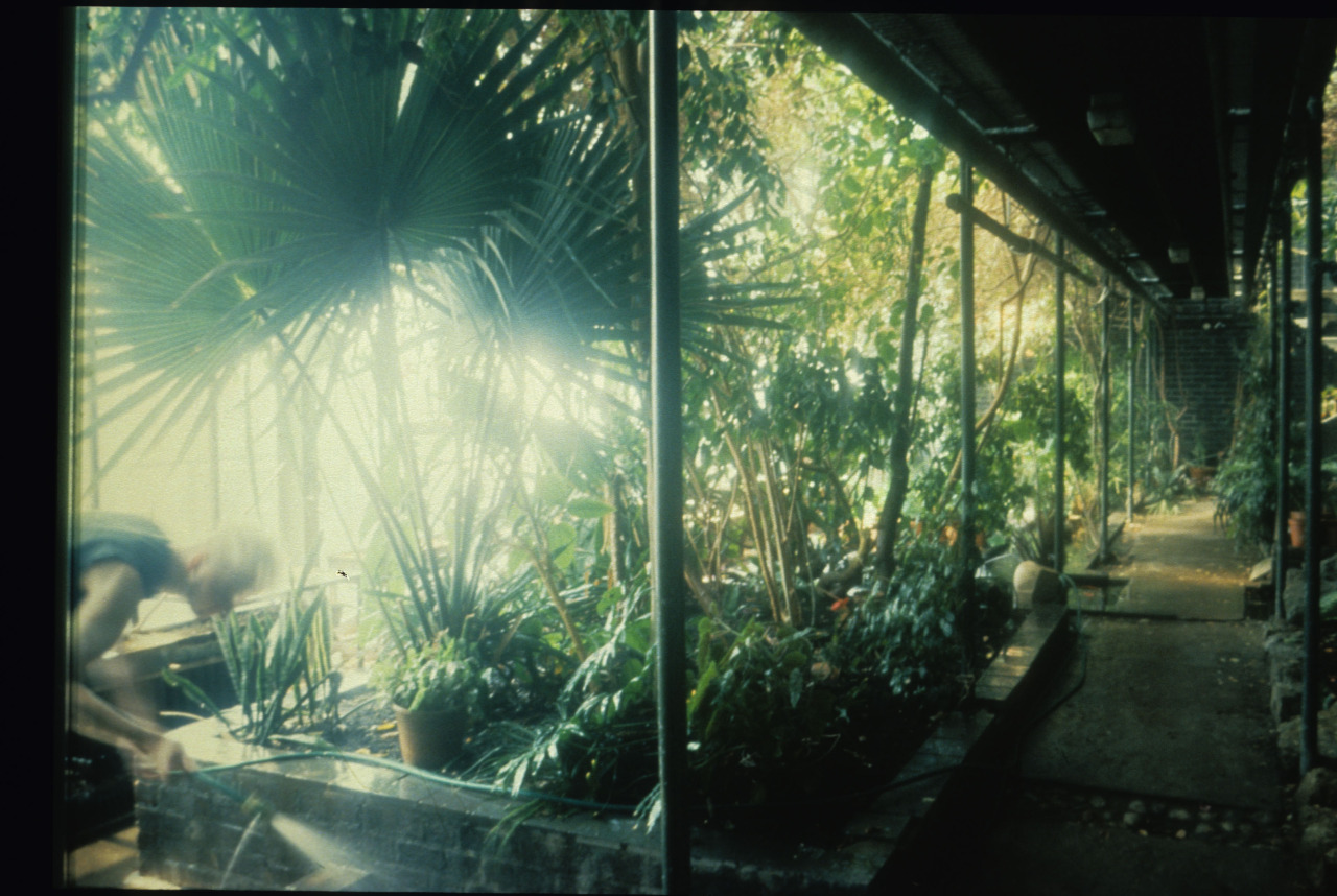
The Greenhouse was closed in the early 1990s following the end of the Environmental course a few years prior. It had been built in 1961 according to the intention of then Rector Robin Darwin, whose studio sat at the back of the ‘house amongst the canopies John Norris Wood had been appointed tutor of Natural History and Ecological Studies in 1971, caring for the plants…

The Greenhouse, courtesy of the RCA Archive
“At the top of the Darwin Building, high above the concrete jungle of London, the Greenhouse is situated as if in a glass cloud almost oblivious to the industrial city outside…


Sir Robin Darwin had the place built as an integral part of the college, consider[ing] it important as a reminder of the natural world beyond the city limits.


The plants and animal life are now well established with mature trees up to the roof, many sub-tropical birds, fish and some reptiles. The large amount of leaf canopy and vegetation enable the birds to co-exist together, forming their own territories and social pecking orders.’


The light filters through the leaves with a glow of colour and dappled tones.


After watering, the humid air is heavily scented like a downpour on a summer’s day.


The rich warbling, musical notes of the canaries fill the air with song, accompanied by the continual ze-ze-zeee-zeee of the zebra finches.


In the background, a loud abrupt whistle interrupts the flowing cascade of the canaries. Looking down from the foliage, a large gleaming yellow eye stares like a sulphurous sun against the darkest of skies. The glossy starling watches and then with remarkable agility and quick angular wing strokes, flies off; a blaze of topaz blue and emerald green.”


The Greenhouse was closed in the early 1990s following the end of the Environmental course a few years prior. It had been built in 1961 according to the intention of then Rector Robin Darwin, whose studio sat at the back of the ‘house amongst the canopies.


John Norris Wood had been appointed tutor of Natural History and Ecological Studies in 1971, caring for the plants and animals and holding specialist drawing classes up ‘til it was shut in order to make space for new developments in the Darwin Building. As described in Boys’s book: ‘On looking further out beyond the glass is a back-drop of irregular sharp-angled buildings. The artificially created world outside is enveloping all around.’


At this point the only comparable space would be the enveloped Fern Garden, a gift from the USA Olympic Team – a thank you for ‘our’ hospitality and the lending of the College as a Conference Centre and hangout for the sporting elite.


The Fern Garden is off limits. Described as the Rector’s ‘private project’ they are protected by bolts, balconies and the backs of bureaucrats as they type faceless emails concerning the protection of the ground against artistic endeavor. Reported to have cost millions to ship from Australia, the Ferns drain further thousands on each specialist hydraulic act, momentarily flooding their canopies in this false climate.

June, 2014

All text originally published in Head, Heart & Hand by the Royal College of Art. All images courtesy of magazine and artist. All text copyright Billie Muraben.

It’s Nice That

The Ulm Model: A School and Its Pursuit of a Critical Design Practice

“My feeling is that the Bauhaus being conveniently located before the Second World War makes it safely historical”, says Dr. Peter Kapos. “It’s objects have an antique character that is about as threatening as Arts & Crafts…

Foundation course exercise, courtesy of HfG-Archiv/Ulmer Museum
“My feeling is that the Bauhaus being conveniently located before the Second World War makes it safely historical”, says Dr. Peter Kapos. “It’s objects have an antique character that is about as threatening as Arts & Crafts, whereas the problem with the Ulm school is that it’s too relevant. The questions raised about industrial design [still apply], and it’s project failed – their social project being particularly disappointing – which leaves awkward questions about where we are in the present.”


Kapos discovered the Hochschule für Gestaltung Ulm, or Ulm school, through his research into the German manufacturing company Braun, the representation of which is a specialism of his archive, das programm. The industrial design school had developed out of a community college founded by educationalist Inge Scholl and graphic designer Otl Aicher in 1946. It was established, as Kapos writes in the book accompanying the Raven Row exhibition, The Ulm Model, “with the express purpose of curbing what nationalistic and militaristic tendencies still remained [in post-war Germany], and making a progressive contribution to the reconstruction of German social life.”


The Ulm school closed in 1968, having undergone various forms of pedagogy and leadership, crises in structure and personality. Nor the faculty or student-body found resolution to the problems inherent to industrial design’s claim to social legitimacy – “how the designer could be thoroughly integrated within the production process at an operational level and at the same time adopt a critically reflective position on the social process of production.” But while the Ulm school, and the Ulm Model, collapsed it remains an important resource, “it’s useful, even if the project can’t be restarted, because it was never going to succeed, the attempt is something worth recovering. Particularly today, under very difficult conditions.”


Max Bill, a graduate of the Bauhaus and then president of the Swiss Werkbund, arrived at Ulm in 1950 – having been recruited partly in the hope that his international profile would attract badly needed funding – and tightened the previously broad curriculum, established by Marxist writer Hans Werner Richter, around design, mirroring the practices of his alma mater.


Bill’s rectorship ran from 1955-58, during which “there was no tension between the way he designed and the requirements of the market.” The principle of the designer as artist, a popular notion of the Bauhaus, curbed the “alienating nature of industrial production”. Due perhaps in part to the trauma of WW2 people hadn’t been ready to allow technology into the home that declared itself as technology. “The result of that was record players and radios smuggled into the home, hidden in what looked like other pieces of furniture, with walnut veneers and golden tassels.” Bill’s way of thinking didn’t necessarily reflect the aesthetic, but it wasn’t at all challenging politically. “So in some ways that’s really straight-forward and unproblematic – and he’s a fantastic designer, an extraordinary architect, an amazing graphic designer, and a great artist – but he wasn’t radical enough. What he was trying to do with industrial design wasn’t taking up the challenge.”


In 1958 he stepped down, having failed to “grasp the reality of industrial production simply at a technical and operational level… [or] recognise its emancipatory potential.” The industrial process had grown in complexity, and the prospect of rebuilding socially was too vast for single individuals to manage. It was no longer possible for the artist-designer to sit outside of the production process, because the new requirements were so complex. “You had to be absolutely within the process, and there had to be a team of disciplinary specialists – not only of material, but circulation and consumption, which was also partly sociological. It was a different way of thinking about form and its relation to product.”


After Bill’s departure, Tomás Maldonado – an instructor at the school, “set out the implications for a design education adequate to the realities of professional practice.” Changes were made to the curriculum that reflected a critically reflective design practice, which he referred to as ‘scientific operationalism’ and subjects such as ‘the instruction of colour’, were dropped. Between 1960-62 the Ulm Model was introduced: “a novel form of design pedagogy that combined formal, theoretical and practical instruction with work in so-called ‘Development Groups’ for industrial clients under the direction of lecturers.” And it was during this period that the issue of industrial design’s problematic relationship to industry came to a head.


In 1959, a year prior to the Ulm Model’s formal introduction, Herbert Lindinger, a student from a Development Group working with Braun, designed an audio system. A set of transistor equipment, it made no apologies for its technology, and looked like a piece of engineering. His audio system became the model for Braun’s 1960s audio programme, “but Lindinger didn’t receive any credit for it, and Braun’s most successful designs from the period derived from an implementation of his project. It’s sad for him but it’s also sad for Ulm design because this had been a collective project.”


The history of the Braun audio programme was written as being defined by Dieter Rams, “a single individual – he’s an important designer, and a very good manager of people, he kept the language consistent – but Braun design of the 60s is not a manifestation of his genius, or his vision.” And the project became an indication of why the Ulm project would ultimately fail, “when recalling it, you end up with a singular genius expressing the marvel of their mind, rather than something that was actually a collective project to achieve something social.”


An advantage of Bill’s teaching model had been the space outside of the industrial process, “which is the space that offers the possibility of criticality. Not that he exercised it. But by relinquishing that space, [the Ulm school] ended up so integrated in the process that they couldn’t criticize it.” They realised the contradiction between Ulm design and consumer capitalism, which had been developing along the same timeline. “Those at the school became dissatisfied with the idea of design furnishing market positions, constantly producing cycles of consumptive acts, and they struggled to resolve it.”


The school’s project had been to make the world rational and complete, industrially based and free. “Instead they were producing something prison-like, individuals were becoming increasingly separate from each other and unable to see over their horizon.” In the Ulm Journal, the school’s sporadic, tactically published magazine that covered happenings at and the evolving thinking and pedagogical approach of Ulm, Marxist thinking had become an increasingly important reference. “It was key to their understanding the context they were acting in, and if that thinking had been developed it would have led to an interesting and different kind of design, which they never got round to filling in. But they created a space for it.”

“[A Marxian approach] would inevitably lead you out of design in some way. And the Ulm Model, the title of the Raven Row exhibition, is slightly ironic because it isn’t really a model for anything, and I think they understood that towards the end. They started to consider critical design as something that had to not resemble design in its recognised form. It would be nominally designed, the categories by which it was generally intelligible would need to be dismantled.”


The school’s funding was equally problematic, while their independence from the state facilitated their ability to independently validate their social purpose, the private foundation that provided their income was funded by industry commissions and indirect government funding from the regional legislator. “Although they were only partially dependent on government money, they accrued so much debt that in the end they were entirely dependent on it. The school was becoming increasingly radical politically, and the more radical it became, the more its own relation to capitalism became problematic. Their industry commissions tied them to the market, the Ulm Model didn’t work out, and their numbers didn’t add up.”


The Ulm school closed in 1968, when state funding was entirely withdrawn, and its functionalist ideals were in crisis. Abraham Moles, an instructor at the school, had previously asserted the inconsistency arising from the practice of functionalism under the conditions of ‘the affluent society’, “which for the sake of ever expanding production requires that needs remain unsatisfied.” And although he had encouraged the school to anticipate and respond to the problem, so as to be the “subject instead of the object of a crisis”; he hadn’t offered concrete ideas on how that might be achieved.


But correcting the course of capitalist infrastructure isn’t something the Ulm school could have been expected to achieve, “and although their project was ill-construed, it is productive as a resource for thinking about what a critical design practice could be in relation to capitalism.” What’s interesting about the Ulm Model today is their consideration of the purpose of education, and their questioning of whether it should merely reflect the current state of things – “preparing a workforce for essentially increasing the GDP; and establishing the efficiency of contributing sectors in a kind of diabolical utilitarianism.”

January, 2017

All text originally published by itsnicethat.com. All images courtesy of magazine and artist. All text copyright Billie Muraben.

It’s Nice That

The New Look: Looking Back at Roundel’s 1980s Identity Design for British Rail’s Railfreight

At the launch of the Design Business Association in 1986, John Bateson, a graphic designer and later partner at design agency Roundel, met a product designer who was working with British Rail’s Railfreight on a repainting scheme…

Railfreight icons, Roundel
At the launch of the Design Business Association in 1986, John Bateson, a graphic designer and later partner at design agency Roundel, met a product designer who was working with British Rail’s Railfreight on a repainting scheme. To the comment on their “not really knowing what colour to paint the trains,” John suggested that it really depended on “what they were going to put on them, before they could know what colour to use”.

This was the beginning of Roundel’s identity design commission with Railfreight, a project run by British Rail’s now defunct Architecture and Design division, which was headed up by Jane Priestman. The intention was to convey the success and value of Railfreight, and its various sectors – distribution, petroleum, metals, coal and construction; and Roundel were to communicate that via both an inward and outward facing redesign that would change the perception of, and culture within, the organisation.

“The culture had been ‘dirt’. Steam railways were filthy, stations were filthy, so they were designed accordingly,” John says. “Jane Priestman said no to all that, which is why we now have white floors and white tiling in stations – because it rewards cleaning. We carried that through to Railfreight, the locos and everything. It seems like obvious stuff but it changed the culture.”


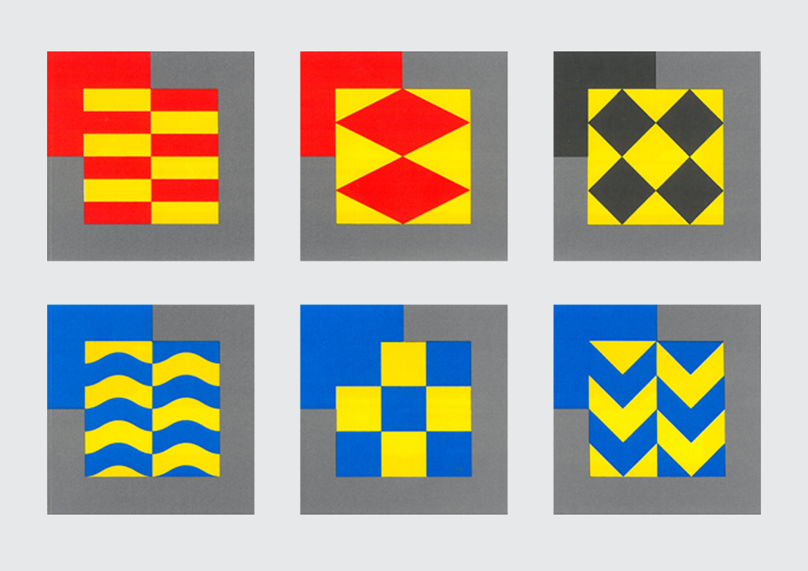
Each train belonged to a sub-sector and a depot. The sub-sectors were designed to be recognisable as a family –  with symbols containing the letter “F” which also formed an optimistic upwards arrow that sat within each mark. They rejected the drab, camouflage colours that had often been used, in favour of bright primaries that could be read at speed and from a distance. The inspiration came in part from the Mustang fighter jets employed during WWII, both in terms of markings and the need to express confidence and strength. 
The marks were designed by Roundel and drawn by illustrator and Scraperboard artist Ron Mercer, who produced each element by hand. “The tone and form was the domain of Roundel, I was the artworker. I think that since the advent of the Apple Mac there has been some merging of design and artwork but in my day the two arms were quite separate,” he says.


The major Railfreight depots each had their own mascot, including a rat, horse, and cat – “I recall that the Stratford depot were particularly keen on having the Cockney Sparrow for theirs,” says Ron. They had long been key to their unofficial identities, and as part of Roundel’s identity design they restyled each of the mascots and established them as integral elements of the locomotive livery. They appeared as depot plates on the cab side, as well as on lapel badges, mugs, sports kits and signing.

“The mascots were made in chromium, bolted plates that rewarded cleaning,” says John. “The idea was to build a sense of pride in the work and their environment. The plates clarified that the trains were theirs, and prevented the cabs from becoming dumping grounds. It was all part of the culture change.” Previously, the macho culture at the depots had meant that the trains would go around rather than through the cleaning machines, dirty being the look of the day for locomotives. But the pride of ownership engendered through the depot mascots meant that the trains were maintained and rarely out of service, as were the depots themselves. As well as their symbols and mascots, each site and sub-sector had its own internal stationery, improved seating, televisions, washing machines and crisp, bright paint jobs. All of these small details instilled pride, respect and a sense of optimism in opinions on Railfreight, from both workers and the general public.


As part of the drive to launch the new identity, Roundel produced invitations, menus, “After Freight” mints, Christmas cards and a Railfreight calendar. The calendar was shot at various locations – on main-line bridges, at depots, in stone quarries and in front of power station calling towers. “We wanted to establish the trains as heroes. The drivers thought we’d shot train sets initially because they couldn’t believe the scale of the compositions or the operation. We’d have to shut the main-line and shoot overnight, it cost a tonne,” says John. “We lit the coal chimneys with flood lights on one night, which ended up getting us a visit from the local emergency services because someone thought the whole place was about to go up in flames. We had to say ‘Oh actually no, we’re just taking some pics!’, they weren’t best pleased so after that we only had an hour or so to get the shots.” The purpose was to further demonstrate a sense of heroism, value and pride in the work of and by Railfreight, and be another element of the work towards a culture change.


Roundel’s identity design had been commissioned in response to the changes in the UK’s manufacturing industries, and amongst the threat/atmosphere of privatisation. In an internal pamphlet describing “The New Look”, Railfreight’s director Colin Driver described how the British Rail board had issued a design policy statement stressing that “design, in its broadest sense, is fundamental to the efficiency of every aspect of the railway. From livery to to locos, mess rooms to engine sheds, this applies very powerfully to Railfreight. British Rail’s design director Jane Priestman points out that ‘to remain in business we must persuade very discerning customers of the ability of THIS business to perform better than any other.’”


Further elements of their promotion were a “Strategy and Image” conference and customer brochure. The conference was based on an “airforce theme” – a principle relevant because of the aesthetic inspiration, as well as “the ethos of team spirit, interdependence and pride”. Meanwhile the brochure described the weight of experience, competitive spirit and potential to be “poised for Europe” amongst sci-fi imagery in acid tones, produced using one of the first digital editing programs.


Jane Priestman’s department, British Rail’s internal Architecture and Design resource, was one of the last centralised, public sector design departments. And the Roundel-designed brochure for A&D was fittingly of its time. The imagery was collaged by hand, and appears somewhat abstract and postmodern; the bins look like Corinthian columns, while the arches and landscape architecture reflect amphitheatres and palaces. Design for the stations is described in turn as adventurous, decorative and Classical, and it underlines British Rail’s policy of “good design [as] good business”: “Good design helps sell services, improves staff morale and brings about the clearest visual indication of control and commitment to quality performance,” said Anthony Howard, the design manager at British Rail A&D at the time.


This focus on quality and coherence, of the architecture, interior and graphic design being co-ordinated and driven by not only profit but pride seems archaic in the current climate of embedded or threatened privatisation. “Since privatisation the focus has moved towards marketing and commercial enterprise. Centralised control seems outdated and inflexible because it’s all changed. But now though we have lost much of the design clarity and visual cohesion that made for an integrated network,” says John Bateson. “Centralised control seems spooky now, because it’s all changed.” And while in a lot of ways it feels like a change for the worse, there are positives to be drawn. “Company identities can’t, and don’t need to be long-term anymore. The top-down ‘Chairman says’ stuff doesn’t really fly when a tweet can destroy a brand in a day. They have to listen and evolve, if you want to survive you have to be fleet of foot.”

November, 2016

All text originally published by itsnicethat.com. All images courtesy of magazine and artist. All text copyright Billie Muraben.

It’s Nice That

Hippie Modernism: The Struggle for Utopia

Hippie Modernism: The Struggle for Utopia examined the intersections of art, architecture and design with the counterculture of the 1960s and early 1970s Shown at the Walker Art Center, Minneapolis earlier this year, the exhibition was loosely organised around Timothy Leary’s famous mantra, “Turn On, Tune In, Drop Out”…

Spread from Hippie Modernism, published by the Walker Art Center
Hippie Modernism: The Struggle for Utopia examined the intersections of art, architecture and design with the counterculture of the 1960s and early 1970s. Shown at the Walker Art Center, Minneapolis earlier this year, the exhibition was loosely organised around Timothy Leary’s famous mantra, “Turn On, Tune In, Drop Out” and charted the social, cultural and professional revolutions of the period.

The catalogue accompanying the exhibition goes further still, considering practices of radical architecture and anti-design movements that emerged through Europe and North America, as well as the print revolution and new forms of theatre and radical politics. Here we speak with the show curator and editor, Andrew Blauvelt, about the work and impact of the critically under-served movement.


Q: Although art and culture has been so clearly influenced by this period, there have been few major museum shows documenting the counterculture. Why do you think this is, and what did you hope to achieve in Hippie Modernism?


There have been many more focussed shows on discrete aspects of the period, which has really come into art historical fashion over the last decade or so. But generally speaking most major museums wouldn’t touch the material because it’s not squarely in the art camp, or the art canon of the period. Too much “ephemera,” or what we call graphic design.


When we think of the 1960s we typically associate it with many of the other important movements: Pop, Conceptualism, Land Art, Body Art, Minimalism, etc. By doing Hippie Modernism I hoped to focus more attention on these highly experimental practices, and by doing so open new spaces for understanding work from the period that didn’t conform to the canonical narrative. Just as we search for evidence of modernism in far flung geographies now, we can also look at the overlooked closer to home.


Q: Could you elaborate on the term “hippie modernism”?


It seems to be an oxymoron, mostly because of what we think modernism is or was supposed to be. I was attracted to this essential conundrum. However, in the course of making the show and the book it became clearer that the term in fact embodies the contradictions of what would later become known as postmodernism (a critique of modernism). And from today’s vantage point, it might be considered simply as “another modernism,” alternate ways of making art, using technology, and shaping society.


Q: In the introduction to the book you mention the shared sense of struggle and need to “start from zero” in the hippie counterculture and modernism. Although elements of culture and technology have progressed in many ways, we are still bound to the problems and hopes of the period, and much of what is discussed in the book and exhibition still rings true today.


Oh yes: climate change, Black Lives Matter to take just two major examples. Progress can be glacial. Struggle seems eternal. We still struggle for our own utopia. I did not want to buy into the failure narrative of the 1960s, which was after all a history underwritten by the conservative political victories of the 1980s. In my opinion, that victory was fleeting as culture continued on a trajectory set into motion during the 1960s. The struggles continue in no small part because the system transfigures its themes and ambitions. For instance, the communalism of the 1960s has been recast as the sharing economy today: couch surfing becomes Air B&B, and so on.

Q: “Stay hungry. Stay foolish”, a phrase published in the Whole Earth Catalogue, was very much key to the counterculture but has now been adopted by Silicon Valley entrepreneurs after Steve Jobs used it in a commencement speech. There is incredible irony in this, when you look back at the ideas of the period – it’s also interesting to consider that the tech industry might now see itself as a counterculture.


Ah, the catchphrase of the entrepreneur. We should remember that in the 1960s computing was the province of large corporations, big government, and the military. The countercultural dream was for personal computing. That computers (and portable video and even television too) could be radically democratic tools to unleash individual creativity and connect people. This was a revolutionary idea. Jobs and Gates were the beneficiaries of this revolution, Zuckerberg and Brin must contend with its legacy.

The cross-disciplinary nature of the work of the counterculture led to what could amount to a whole “lifestyle” – as embodied by Stewart Brand’s Whole Earth Catalogue, would you say that in some ways what was being made was a sort of active sketch of what is possible?


Yes. I say in the book that the counterculture was so successful in its moment because it actively ‘prototyped’ the future it wanted to live. If you want sexual liberation you must live it now not simply ask for it, for instance. Don’t want to work 9-5 in a soulless job, then invent a world or counter economy in which you don’t. Even if it fails, it provides a glimpse and a taste of what is possible and that has more lasting consequence and value.
These ideas have become creatively recharged and recast today, and the point is not about claims to originality but rather ideas of continuity. Why does this past look particularly appealing today?


Q: The architectural group Archigram were one who so brilliantly predicted the tethering of our bodies to digital devices, examples including the Electronic Tomato and Info-Gonks – were you surprised by any of the predictions you came across in your research?


Always. Info-Gonks as Google Glass. The Provo legacy project of the Witkar—an electric car sharing program in Amsterdam in the 1970s and 1980s. Archigram’s Room of a 1000 Delights as virtual reality. Superstudio’s Supersurface as Internet. Heineken’s World Bottle: a glass beer bottle as an upcycled building brick. The Videofreex Lanesville TV project, which prefigured community television and “user-contributed content.” Ant Farm’s Truckstop Network and YouTube. It was a visionary period.


Q: Publishing had a really interesting role, particularly in the sense that it very much took on the idea of the role of publishing as creating or being for a public, which magazines would you say exemplify the time?


Three come to mind and are in the show. Aspen, “the magazine in a box,” which was a thematic publication with a unique art director for each issue. It was an assemblage of material and media: pamphlets, posters, loose images, flexidisks, film and music reels—the message in multiple media. The other discovery was Scanlan’s, art directed by the incredible Barbara Stauffacher Solomon, who was famous for her supergraphics. It was a muckraking-type journal, which gave the world gonzo journalism and was the first to call for the impeachment of Richard Nixon. Both were essentially forced out of business ostensibly because they did not conform to postal regulations or were blacklisted by printers. Oz magazine broke ground on both the design and content front. It was subject to censorship.


The book is not like a traditional exhibition publication, in that its focus is on the subject rather than being a record of the show specifically. Could you elaborate on your thinking when putting the book together?


I worked with Emmet Byrne, the design director at the Walker, on the book’s design. We share similar concerns when making a book, on the one hand we are inspired by the content and the period yet we do not want to create a simulation of it. We hope to create something fresh and new but also something that could not have been made without having been influenced by its content.


Materially, physically, it is a mash-up of the heft of a Whole Earth Catalog (including its form as a paperback) and the colouring of the People’s Yellow Pages (a telephone book of free things in the Bay Area). Our initial plan had been to use Helvetica, which was truly revolutionary at that time, but once you see Scanlan’s typography there’s no point trying to emulate that. We needed more hippie in the mix. For the sake of time, we didn’t use rubber stamp type, although it was very tempting. The typewriter and Cooper were deployed instead.


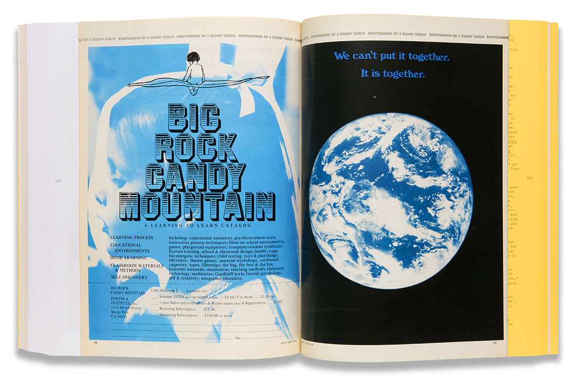
The funky silver paper with color and black and white repros is pure Emmet. These pages function like “ads” for different works in the show, sometimes they simply recreate an actual ad, but often they are fabricated. Here we also diversified the typographic and stylistic palette, Day-Glo was invented in the Bay Area and it hadn’t really been exploited until this period, hence the fluorescent yellow.


My idea was to include the facsimile reprint of “Advertisements of a Counter Culture” that first appeared in Progressive Architecture magazine (and presumably got the editor fired). I wanted to riff on this idea of making ads for a counter culture and extend it. I wish we had time and space to make more of them.


What should the reader take from the use of Buckminster Fuller and Shoji Sadao’s US Pavilion for Expo 67 caught in flames as the cover image?


Well, when the dome burned in 1976, the bicentennial of the United States, it seemed to signify the end of the countercultural era. All those dreams go up in flames. Or do they? From the ashes of the dome (the metal lattice structure survived, the plastic coating melted away), a museum of the biosphere rose inside it. That seemed like an interesting way to think of the fate and future of hippie modernism.

April, 2016

All text originally published by itsnicethat.com. All images courtesy of magazine and artist. All text copyright Billie Muraben.

It’s Nice That

A City of Contradictions: Meet the People Shaping Beirut’s Creative Future

Beirut is a city of contradictions, both buoyed and bound by its past and present the push and pull between its history and future is particularly acute in the divergent experiences of older and younger generations…

By Tanya Traboulsi

Beirut is a city of contradictions, both buoyed and bound by its past and present; the push and pull between its history and future is particularly acute in the divergent experiences of older and younger generations. The Lebanese Civil War ended in the autumn of 1990, and now the generation born at or towards its end, who have lived through its consequences and inherited its legacy from their families are working towards a new creativity, one that recognises but is not necessarily defined by history.


Ayla Hibri, a photographer who returned to Beirut in 2015 after stints all over the world, says: “Not only have we experienced a lot of trauma but we’ve inherited a lot of baggage from our parents. You want to move on and put the ugly past behind you, but you also want to analyse it and understand what the hell happened. There is the residue of war but we don’t have the same frustrations, the work being produced now is very different.”


A steadily increasing number of residency programmes, collective workspaces, independent galleries and publications have played a significant role in the emergence of a new design movement. Mansion, a 1930s villa that had been abandoned during the civil war, reopened in 2012 as a collective space. Funded by donations, as well as providing studios for local artists, designers and architects, Mansion hosts a public programme of films, discussions and exhibitions. Ghaith Abi Ghanem and Jad Melki, who run an architectural firm from Mansion say “it opens up possibilities outside of typical employment and encourages young designers to have a space to experiment and produce in the heart of the city.”


As well as Mansion, there is Alt City and The Olive Grove which is due to open this year. Designed by TWIG Collaborative, an interdisciplinary group of architects and designers who have also worked on the concept, operating model and branding for the site, The Olive Grove will be a co-working space designed to encourage collaboration. “As a design firm, but even more as a collaborative platform, we think socially responsible design is of the utmost importance. Designers play a key role in improving and enriching our lives, how we interact and the world around us,” says TWIG Collaborative’s Sirena Varma. “Our problems arise from the political situation, which has caused so many young and talented people to leave Lebanon. ‘Brain drain’ is an unfortunate phenomenon here, which is why The Olive Grove encouraging and guiding young entrepreneurs is so important,” she continues.

“There are amazing initiatives popping up everywhere despite the barriers of the city, it’s extremely motivating,” says Maya Moumne of graphic design studio Studio Safar. They launched a journal two years ago, “inspired by Mohieddine El Labbad’s series of publications, Nazar, which is Arabic for ‘vision’. Dubbed the ‘Egyptian Milton Glaser’, El Labbad’s Nazar observed and critiqued the visual culture and graphic design in the Arab world from the 1980s onwards.” It was one of few publications to focus on design in the region, and in Journal Safar they are continuing the legacy, publishing bilingual stories on graphic design, food, film, art, comics and poetry.


As is the case in most cities, there is a balance of people working freelance, in collectives or at larger studios and agencies. Beirut is fast-paced, the creative scene thriving against the odds. “It’s still nascent,” says illustrator and designer Cynthia Merhej”. “But it’s becoming more diverse. When people come back [after studying abroad] they want to do something that is going to make a change. We are more flexible [than older generations], you kind of have to be. I work as a photographer, illustrator, DJ, and now as a fashion designer. I used to also be a graphic designer. You have to diversify, nowadays you are just expected to know more”.


Working collaboratively, in groups such as Samandal Comics, a non-profit releasing magazines and comics anthologies, which was founded in 2007, can also motivate broader impact. “Samandal Comics draws attention to authors in Lebanon and the Arab world. We have gained notoriety and inspired similar initiatives in Egypt, Morocco and Tunisia,” says Joseph Kai. Late last year they were found guilty of inciting sectarian strife, denigrating religion, publishing false news, defamation and slander with a fine of the equivalent of close to £15,000. The case had been opened in 2008 after the minister of information had taken a disliking to panels in two satirical comics, which he then took out of context. On the Samandal Comics website a statement describes how “the court fell back on the vagaries of an elastic censorship law and a cohort of complacent public servants to criminalise and punish us, in the process committing several legal violations to wit.”


Beirutis defy being defined by trauma, understanding how to tackle day-to-day challenges with flexibility and adaptability. Electricity and water supplies are regularly shut off – sometimes for months; post must be sent via airmail or private couriers due to a lack of infrastructure and volatile neighbours; and in last year’s garbage crisis, refuse wasn’t collected for more than eight months after the closure of a waste dump south of the city.


Sarah Hermez, a Lebanese-American fashion designer who launched Beirut’s non-profit fashion school The Creative Space, says: “Lebanon is a pretty politically unstable country. We lack basic government services and have not had a president in place for over two years, let alone being in between Syria and Palestine, two extremely volatile places. The political gridlock and the greater humanitarian strife around us causes a lot of dissatisfaction and unrest. This, juxtaposed with our very pleasant Mediterranean environment, causes a strange tension which manifests in much of the creative work that comes out of the country.”


Unlike most cities with warmer climes, life stirs up in the summer as much of the diaspora return. “In spite of high temperatures and humidity, people keep working, running and sweating… The messiness of the city makes us want to escape but somehow we can’t seem to live anywhere else,” says art director Tala Safié”. “It’s a peculiar city. When you are away from it, it’s all you talk about. It’s alive, the food is great, the weather is perfect and it’s so small you can ski and swim in the same day. When you’re there, all you do is complain about how chaotic, loud and suffocating it is. You’re stuck in this never-ending love-hate loop – wanting to be there and wanting to leave, wanting to nurture it and turn your back on it,” says Ayla Hibri.


For writer Gilles Khoury”, it’s possible to find the positive among the chaos. “I talk about frustration with a filter of sarcasm; sadness with an aftertaste of hope, that’s how I function. In a way, political life in Lebanon can become a weapon rather than an enemy.”
Stylist Makram Bitar” adds: “I feel scattered when it comes to describing the creative scene in Beirut. There is a certain dynamism and optimism that I appreciate in people, it requires so much courage and energy to make things happen in the turmoil of a city like Beirut.”


An issue that is mirrored the world over is the lack of diversity within the arts, Sarah Hermez from The Creative Space says: “I think in order for design to be an effective tool for progress in society it needs to be inclusive. We can’t let only a select few design the world around us.” But progress is being made via the collective work-spaces and the free school, as well as new museums and galleries opening, supporting and exhibiting both contemporary and historic work. Online publications such as Raghunter also contribute: “We experience, and offer a lot of support to people around us. Especially with emerging talent, the scene is pretty open… We appreciate each other’s work, and having that type of support really helps to expand business reach and dynamism”, says editor Serene Abbas.


Beirut Madinati is a volunteer-led campaign, which in May of this year won an unprecedented 40% of the municipality vote. The campaign goal was to elect a council of non-partisan experts in the fields of urban planning, economics and waste management, who would address core problems of liveability in the city, as well as broader issues of transparency and social justice.


Graphic designers and illustrators Jana Traboulsi, Maya Saikali, Sana Asseh and Tala Safié were some of the local creatives to work on the campaign, of which Tala says: “Creative work can always be employed as an effective political tool, whether in a subtle or loud voice. The trick I think is to challenge and engage the audience, favouring active, critical readings rather than passive reception.”


Cynthia Merhej, who returned to Beirut to start a clothing line, studied at Central Saint Martins and the Royal College of Art. When she graduated in 2013 “it was ‘immigrants out’ – with the new government situation I had to leave immediately. My visa didn’t even last passed the graduation ceremony. I had to leave the country and come back on a tourist visa to be able to pack my stuff and leave. I didn’t want to come back yet so I went to New Zealand but ultimately, it didn’t work out. When I came back to Lebanon I realised opening my own business is more feasible here. There’s a good support network, people are encouraging, they like something new happening.”


But there are still social rules and expectations in Beirut, and as photographer Tanya Traboulsi describes they “stem from traditions that date back decades if not more. Some are beautiful, some are discriminating and outdated. But the period of abiding to expectations is slowly changing into more independent mindsets and ways of living.” Generations crystallise in hindsight, and in Beirut “everything somehow keeps moving” as Cynthia Merhej says. “Okay it’s not super-easy, it’s the kind of place where people just to try to find a way around things, they’re not just going to stop living because there’s no water or tourists aren’t coming anymore. You just try to be creative about it.”

All text originally published by itsnicethat.com. All images courtesy of magazine and artist. All text copyright Billie Muraben.

Royal College of Art

Book Test Unit: “Who Shot J.R.?”

In the closing scene of the third season finale of Dallas, dastardly oil baron J.R. Ewing was shot by an unknown assailant The question of “Who shot J.R.?” plagued viewers until close to a year later, when it was revealed that he was in fact alive, and the assailant had been none other than…

Stills from Dallas
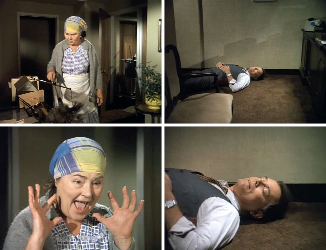
In the closing scene of the third season finale of Dallas, dastardly oil baron J.R. Ewing was shot by an unknown assailant. The question of “Who shot J.R.?” plagued viewers until close to a year later, when it was revealed that he was in fact alive, and the assailant had been none other than his sister-in-law and mistress, Kristin Shephard.

The device of the ‘cliffhanger ending’ has long been popular in television, film and literature; and it now applies in our reading and understanding of news and current affairs, and in an escalated form. The Guardian’s red “Live” box, and its flashing button that accompanied much of 2016 and continues to thrive in 2017—with three potential tabs going on its Minute by Minutes section as I write—has offered live updates and instantaneous reflection on the EU referendum, the US election and the March attack at Westminster. Updating information in fits and starts as events, results, impact and context are understood; establishing strange narratives that shift and change as things unfold, creating sort-of limericks out of world events.

It is not that the reporting of breaking news in the media is a new phenomenon—it has long been applied in radio, television and in newspapers, and is an important service—but live updates, ‘Breaking News’ Twitter profiles, or the BBC app that sends alerts to your phone, exacerbate the potential for ‘cliffhanger endings’ in our understanding of daily life. We can be strung to the page, clicking through as each update arises, the tension mounting when you are only halfway through a note when another part of the story unfolds. Unlike the fans of Dallas who had to wait months on their conclusion, ours are resolved and replaced, sometimes in a matter of seconds.

News, or at least the reading of news, moving predominately online and onto personal devices has, perhaps inadvertently, created a slump in investigative or reflective journalism. We often receive news in a mix, as if we are catching parts of various salacious conversations at orbiting restaurant tables, never quite catching the beginning, or most likely the end, either. Our understanding is with dribs and drabs of context, which will often be fact-checked at a later date, and edited a few times over. The expectation of substance, confirmation, and rigour has made way for news that is immediate, flexible and reactive. As the Blue-footed Booby bird feed undigested, regurgitated fish to their young, we are fed segments of information in bitesize chunks, dependent on the source, but without any particular understanding of it.

Our expectation for instant gratification has led to much-publicised accounts of our degrading attention spans, and think-pieces and advice columns on so-called digital detoxes. If we are to improve our understanding of current affairs, the impact of our decisions and the knock-on effect of events worldwide, a considerable space needs to be marked out for reporting and analysis that surpasses “Whodunnit?”

May, 2017

All text originally published in Book Test Unit, by the Royal College of Art. All images courtesy of magazine and artist. All text copyright Billie Muraben.

It’s Nice That

Elizabeth Friedlander: A Legacy of Letters

On her commission from the then Frankfurt-based Bauer Type Foundry in 1927, Elizabeth Friedlander became one of the first women to design a typeface, and particularly one of such exhaustive variation. Completed in a variety of point sizes in roman letter and cursive, and detailed in bold and swash characters, it took until 1939 for Elizabeth-Antigua and Elizabeth-Kursiv to be cut – six years after Friedlander had been forced to leave Germany.

Elizabeth Friedlander, Prisma
On her commission from the then Frankfurt-based Bauer Type Foundry in 1927, Elizabeth Friedlander became one of the first women to design a typeface, and particularly one of such exhaustive variation. Completed in a variety of point sizes in roman letter and cursive, and detailed in bold and swash characters, it took until 1939 for Elizabeth-Antigua and Elizabeth-Kursiv to be cut – six years after Friedlander had been forced to leave Germany.

Friedlander’s life was one of near-constant shifts, both geographic and in her professional life; born in Berlin, she lived in Milan, went through a lengthy, unfulfilled process of trying for an American visa, lived in London and finally in Kinsale, Ireland. She worked across a range of contexts, from packaging, printmaking and patterns, to calligraphy, clandestine publishing and correspondence. She mixed with the likes of Noël Coward, Jan Tschichold and the Toscanini’s and was equally adept at designing book covers for Mills & Boon as she was at making black propaganda at the department for psychological warfare and forgery techniques as Britain’s Political Warfare Executive.

Born in 1903 to a Jewish family, Friedlander had studied under influential typographer Emil Rudolph Weiss at the Academy of Berlin’s Museum of Decorative Arts, and it was Weiss who introduced her to Georg Hartmann, who ran the Bauer Type Foundry. On graduating, she worked as a designer and calligrapher at Die Dame – Germany’s first illustrated lifestyle magazine for women – and until 1935, been regarded as one of Germany’s pre-eminent graphic designers.

The Reichstag’s passing of the Nuremberg Laws in September 1935, established a legal framework for the persecution of German Jews. On being informed that she was deemed as “lacking the necessary reliability and fitness to participate in the creation and dissemination of German cultural values”, and forbidden from continuing her profession, Friedlander left Berlin. From here, she moved briefly to Milan, applied for a visa to the USA, and in 1939, moved – at the time, temporarily – to London. It was here that she met Francis Meynell – a poet, printer and editor working at the advertising agency Mather and Crowther – who’d edited the Penrose Annual, a review of graphic arts, in which there was a piece on the Elizabeth typeface.

Meynell would go on to be a great advocate for Friedlander and her practice; and Katharine Meynell, Francis’ granddaughter, has taken on that legacy in an exhibition of Friedlander’s work at the Ditchling Museum of Art and Craft. Elizabeth Friedlander is the first show to focus on the designer’s practice, and, fittingly, it stems from a series of chance events, as Katharine Meynell recalls: “I came across an anthology of poetry that Elizabeth had compiled for Francis’ birthday. It was written out in her calligraphic hand but only initialled E. F. so at the time I had no way of identifying it. She had included lots of Meynell poetry, presumably to flatter Francis, by having his work next to Shakespeare’s.”

“Some years later, I was at the St. Bride’s Library researching another project, and the librarian happened to hand me a book that referenced the anthology – Pauline Paucker’s New Borders: The Working Life of Elizabeth Friedlander.” It’s from here that K. Meynell began her research into Friedlander’s life, initially for her film Elizabeth – on display at the show – and then towards the exhibition. “[Friedlander’s] story runs parallel to things that are necessary to think about again”, she says. “I’m interested in thinking about where people end up, and what becomes meaningful when you having to be constantly moving.”

In the period that Friedlander was working, although Europe had been wrecked by WW2 – literally, figuratively and economically, it was still more commonplace for every household to own, and be engaged with, “good” design. A sort-of leftover from pre-war ideals and orthodoxy: “People had very clear ideas on design, and were all writing didactic texts on what was good and what wasn’t. They were terribly certain about it and convinced that they were writing from a neutral, objective position, in a way that seems odd today.” While the impact was non-hierarchical, the certainty of opinion, and paradoxically of objectivity, kept an inferred hierarchy firmly in place. 
“It wasn’t a star system at that time, but there were big personalities,” says K. Meynell, and a factor that impacted Friedlander’s practice, which was very much outside of the merits of her work, was the fact she was considered “unclubable”. “She didn’t fit to the British class hierarchy, and people couldn’t make sense of her. She didn’t behave right or look right, or do right; and Francis would have been completely cool about all of that, because that was the way he was, too.”

Although there is little information available about her personal life, Friedlander catalogued and maintained her work with precision: “She clearly understood the value of her work, but there was a different idea of what the role of the designer might be. Stanley Morison – a typographer and advisor to the British Monotype Corporation – wrote on how individualism was unhelpful in design. He thought that as a printer or designer you ought to be serving the community, making things legible and elegant. Your job was to do the work, rather than announce yourself in front of it.” This was very much the way Friedlander worked, and although her practice hasn’t been widely recognised by the contemporary design ‘canon’, the Elizabeth typeface has been an ongoing critical and commercial success and her work in publishing – particularly that with Penguin – has remained popular, both in itself and via imitation. “Is it self-effacement or is that your position, which you are happy with because you know you’re doing a good job?” considers K. Meynell. And although the thinking – on designers and their position and purpose – was flawed, as it is in every era, there is still room for nostalgia: “There was a sense of the collective, which feels horribly absent at the moment.”

On her arrival in London — on a Domestic Service visa afforded to her by the Religious Society of Friends, or Quakers, who were helping people flee persecution — perhaps coaxed by the aforementioned Penrose Annual Review, Friedlander knocked on F. Meynell’s door at advertising agency Mather and Crowther, to discuss finding work as a designer. She had arrived from Milan, where she’d worked for the publishers Mondadori and Editoriale Domus, as well as with the Toscanini family. The exhibition includes various commissions from Walter, the son of the conductor Arturo Toscanini – record sleeves and labels, and letters: “There’s a fabulous letter from Walter Toscanini, a political diatribe. He felt that the King of Italy had let them all down, Churchill had let them down, everyone… Italy had become Fascist where it could have been prevented. There are several letters of his, there’s another about the beginnings of a European Union Post-War, which was really interesting”, recalls K. Meynell.

While in Milan, and with the help of the Toscanini family, she had made her first of many applications for a visa to the USA, having been offered a job by the Bauer Type Foundry who had opened a New York office. Before she could secure a visa – although she had received recommendations from Toscanini, Random House and Nöel Coward – in 1939, Italy passed fascist laws under Mussolini, and Friedlander was again forced to leave.

“The Toscanini’s were trying to help various people move to the USA. There were lots of people trying to help Friedlander get there – particularly them, but also Nöel Coward and Bauer Type had offered her work at their New York office – but immigration laws meant it wasn’t possible” says K. Meynell. “We construct the legality of individuals and it’s absolutely bonkers. Somebody being illegal is a social construction that we are complicit in.”
Back in London, Meynell had introduced Friedlander to Ellic Howe – an author writing on occultism and the Hermetic Order of the Golden Dawn, who at the time worked for Britain’s Political Warfare Executive at Bush House, on psychological warfare and forgery techniques. He employed Friedlander as head of design and put her in charge of designing and disseminating black propaganda. She’d previously shown her political motivations making literacy books and newspapers for Italian and German prisoners of war; and in her new position, she forged Wehrmacht and Nazi stamps, ration books and other false documents for the political intelligence department.

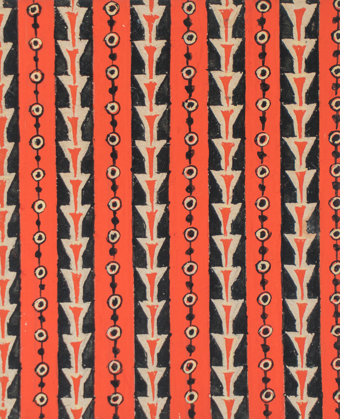
As the war ended, and her position in the UK became more secure, Meynell continued to advocate for her and paved the way for work in both advertising and publishing, with the likes of Penguin, Mills & Boon, Linotype and Monotype. At Penguin, Friedlander worked with Jan Tschichold – who wrote the Penguin Composition Rules as head of typography and production at the publishing house. There she worked on book covers, and was responsible for a lot of their output post-war, while elsewhere she produced borders, maps and drawings for cosmetics labels: “She turned her attention to working on end and cover-papers, book ornaments and greetings cards; and applied the same technical approach she had employed in her typography, to patterns and forms, as well as in her advertising work”, says K. Meynell. “There’s an extraordinary drawing for the mechanism of a lipstick, which employs technical precision in a way that is just bonkers when you look at it. There were also tubes for hand cream, for which she was specifying the milling on the lids, as well as the labels and colour ways – all pastel shades that resemble flavours of ice cream.”

One of her ongoing jobs was the inscriptions for the Roll of Honour at Sandhurst, of the names of Commonwealth officers who had been killed during WW2: “It was virtually unheard of for someone not enrolled in military service to be allowed in, but she wrote every name in her calligraphic hand – and seemed to be good friends with her employers there.”

In the early 1960s, Friedlander moved to County Cork, Ireland, following her friend Alessandro Magri MacMahon, or Sandro – an Irish/Italian author, classics professor and fishing expert – who had also been working in the intelligence services at Bush House: “He had been driven out of Italy because of his anti-fascist activities, and then after being in London, working in intelligence and taking some work as a professor, he moved to Kinsale.” There he worked with the Irish Shark Club, and Friedlander continued to commute to London to work with the Royal Military Academy at Sandhurst while designing letterforms for the Shark Club, and other local affairs.

Friedlander died in 1984. There was little in the way of personal accords, but her professional archive went to friends in County Cork, and later to University College Cork, where it resides today. One item, a violin made in 1703, which had belonged to her mother, had travelled with her from Berlin to Milan, to London, to Kinsale, and now to Cork. It was one of the few personal items Friedlander kept when she fled Berlin, and it’s now loaned out each year to outstanding students at the Cork School of Music. The violin is on display in the exhibition, among an array of musical scores with cover designs by Friedlander. Each cover is made up of a pattern that conveys the shifting times – from repeat forms of traditional, strict, detailed line work; to abstract, loose waves; modernist jiggle marks and playful squiggles. What ties the series together is that, however hard to read, they each maintain continual cycles and loops, much like history.

All text originally published by It’s Nice That. All images courtesy of magazine and artist. All text copyright Billie Muraben.